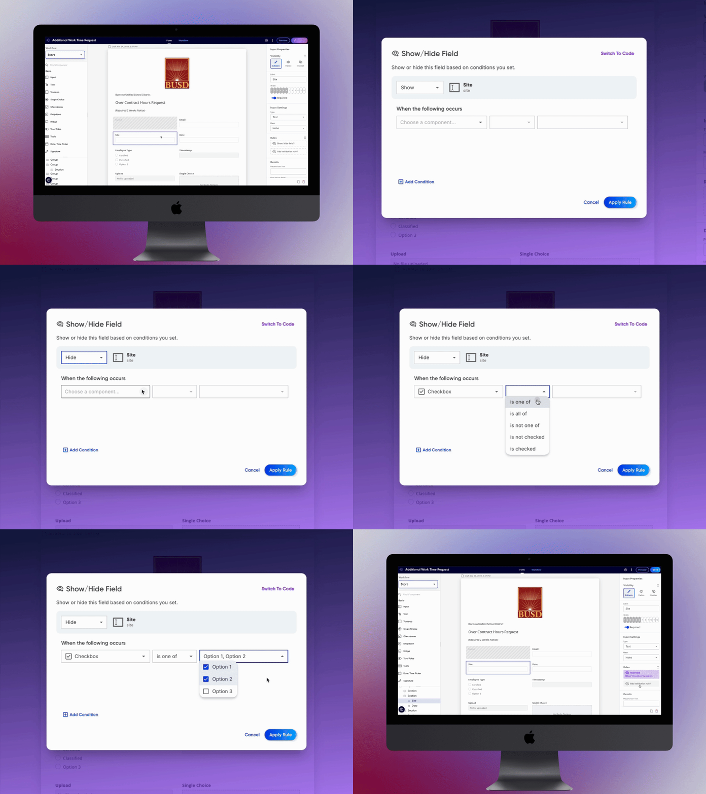
Visual Logic Builder // Droplet
UI/UX Design Project
“Kudos to the design team. You’ve taken something that is very complicated and made it look pretty easy, which is no small feat.”
TL;DR
I helped design a robust experience that allows digital form builders to create conditional logic without having to know any code. This resulted in a 25% reduction in form building time, and 10% reduction in support tickets for our Implementation team.
“That’s great and all but, I don’t know code”
This was an oft repeated lament by many of our users on the Droplet platform. What made our form & workflow tools so powerful was the ability to “automate” them by allowing data to be dynamic. Actions could change depending on certain conditions or inputs from a field on a form. If built properly, a form submission could automatically route through a variety of paths and eventually bring you back the information you needed, all with a single click. And that was the end goal, to gather submission data.
However, this ability to add conditions to actions was only available in code. We had no visual interface, which either forced users to learn some code, or (more commonly) turned them off to the product. This was one of the last major hurdles in our platform that was keeping users from getting to value.
Let’s talk business needs
Users had no use of our platform if they couldn’t gather submission data. To do that, you’d first have to construct and publish a digital form and workflow steps. Too often we were finding that new users were not publishing forms, therefore never getting to value before ditching Droplet for something else. Through observations gathered using PostHog (which allowed us to watch user sessions), we found many free account users stumbled during the form & workflow building process, particularly when it came to making them “smart” through conditional logic.
In order to retain these users, we needed the following:
A visual boolean builder interface allowing users to create conditions (normally reserved for code only)
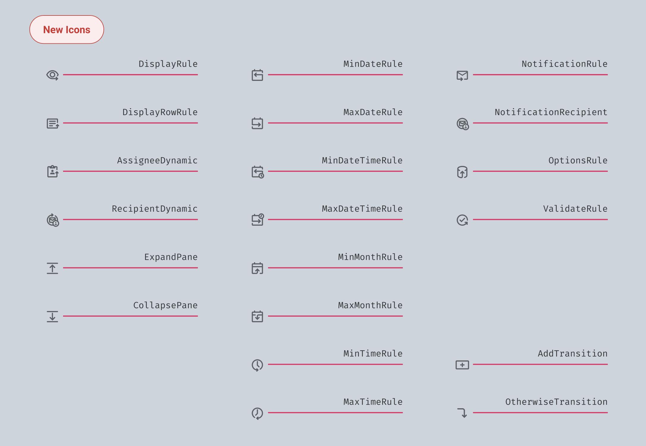
An improved logic affordance applied globally throughout the visual form builder
What were the outcomes?
25% reduction in form building time
10% reduction in support tickets for our Implementation team
Users reported 2K+ form submissions generated within three months that otherwise couldn’t have been done
Satisfied overwhelming demand from users who did not know how to code
So who was this for?
We named our user persona a “Citizen Developer”. In short, this was an individual who, despite no formal background in software development, created or modified applications, software, or other digital tools to meet needs within their organization or community. They were the ones in the trenches, assembling information and then putting it all together by building a digital form, powered by a smart workflow and supported by custom datasets.
A Synopsis of Phase One
Where I began: Learn enough to get oriented
The concept of conditional logic and boolean builders was new to me. I’d never used one, and was not acquainted enough with code to have a clear idea of how they worked or looked in code. The idea overall is simple: If this, do that. Within Droplet’s visual builder tool, we offered 15 types of conditional logic, each with their own nuanced demands. Additionally, logic could be dependent on either an input on a form, or data stored in one of our datasets.
My initial tasks were to:
Gather data to determine use cases for our most commonly used logic types
Design an interface that would enable our “Citizen Developer” persona to build their own conditional logic
Design an interface that could help users build logic by linking to objects in a dataset.
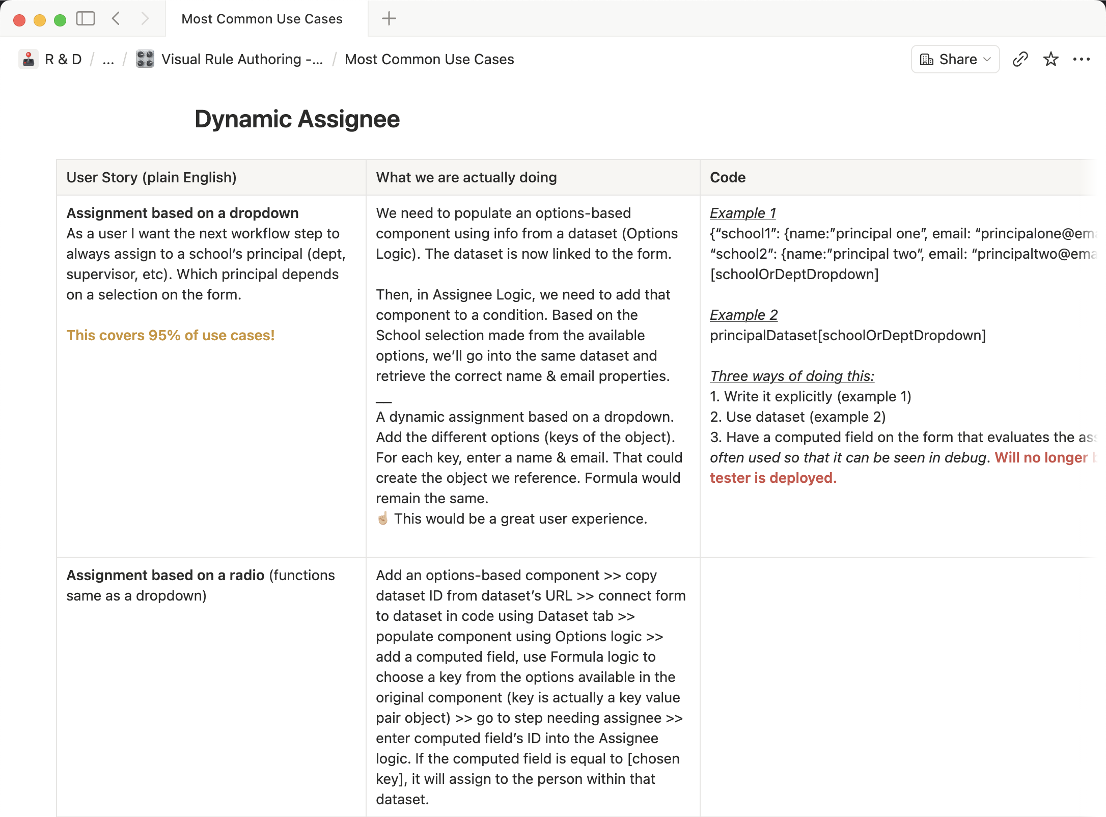
Example from our Notion document
Use cases & comparative research
I needed to visually and functionally understand how this code worked to ensure I’d translate it properly into visuals. I started consulting with members from our Engineering and Implementation teams to get some real code examples. I’ll be honest, it took me some time to fully grasp how conditional logic really worked. Seems silly in retrospect, but hey, we all got to start somewhere.
We chose to focus on our most frequently used logic types: Display, Transitions, Validation, and Dynamic step assignees. I needed to identify our top 80% of use cases for each type. My most helpful resource was Nick, our Subject Matter Expert. He compiled an analysis of our most common use cases, along with code snippets so I could see the full picture. These helped me narrow my scope so I knew what to design for.
I also took a deep dive into the logic builder interfaces for seven other programs. To really wrap my head around logic, it helped to see what solutions others had tried. I compiled these findings into Figma as a reference.
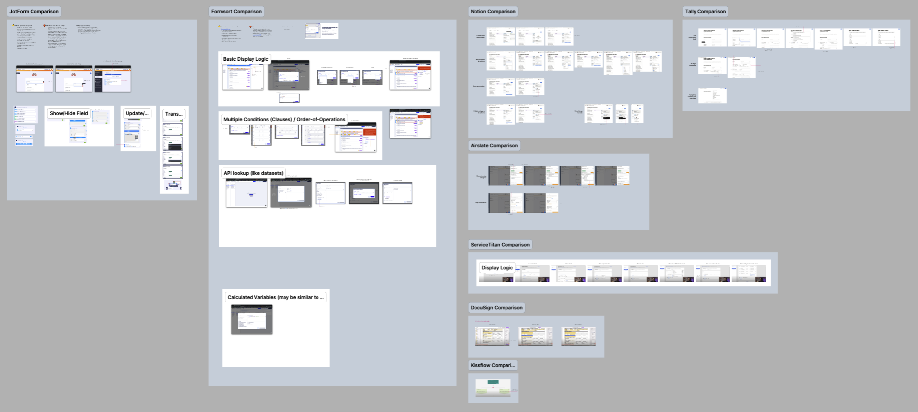
Comparative research from other logic builders
Wrapping Up Phase One
Luckily, my fellow designer Jay had already begun a first-take on the affordance for visual logic building. These I handed off as a sort of starting point for our engineers so they had a sense of where these affordances will live and what the overall experience may feel like. This was intended to be deployed in four phases, each adding greater fidelity and capabilities than the last one.
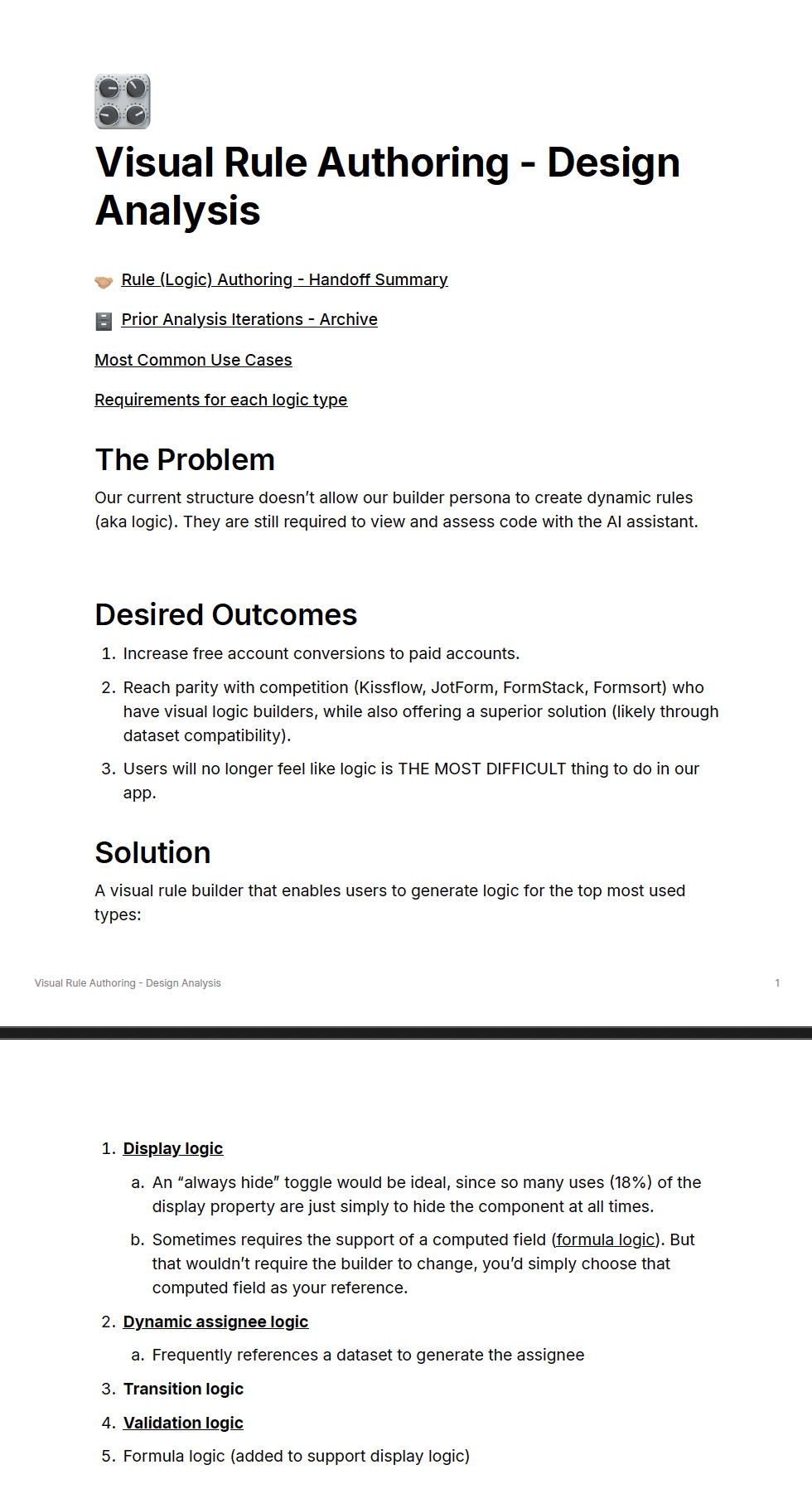
Notion document sample
Moving Into Phase Two
After a hiatus of a few months, I came back onto the project. With the benefit of time to digest previous work, learning a few things in the meantime, and knowing there were competitors I could look to for inspiration, I got off to a new solid start. Using Notion, I drafted a design analysis of the problem we were trying to solve. This clearly defined our desired outcomes, design solutions to accomplish those, and how that address elements of Droplet’s overall product strategy.
Designs For Most Common Logic
Before designs began, I notes these overarching behavioral rules to keep in mind:
Conditions consist of variables and actions. A condition can contain more than one of each.
CRUD ops for Conditions (Create, Read, Update, Delete + Duplicate & Disable)
Clear OOO (Order of Operations)
Show dependencies (props panel, wherever else)
Indicate active b/g logic (props panel, wherever else)
Not yet a limit on how many conditions can be created
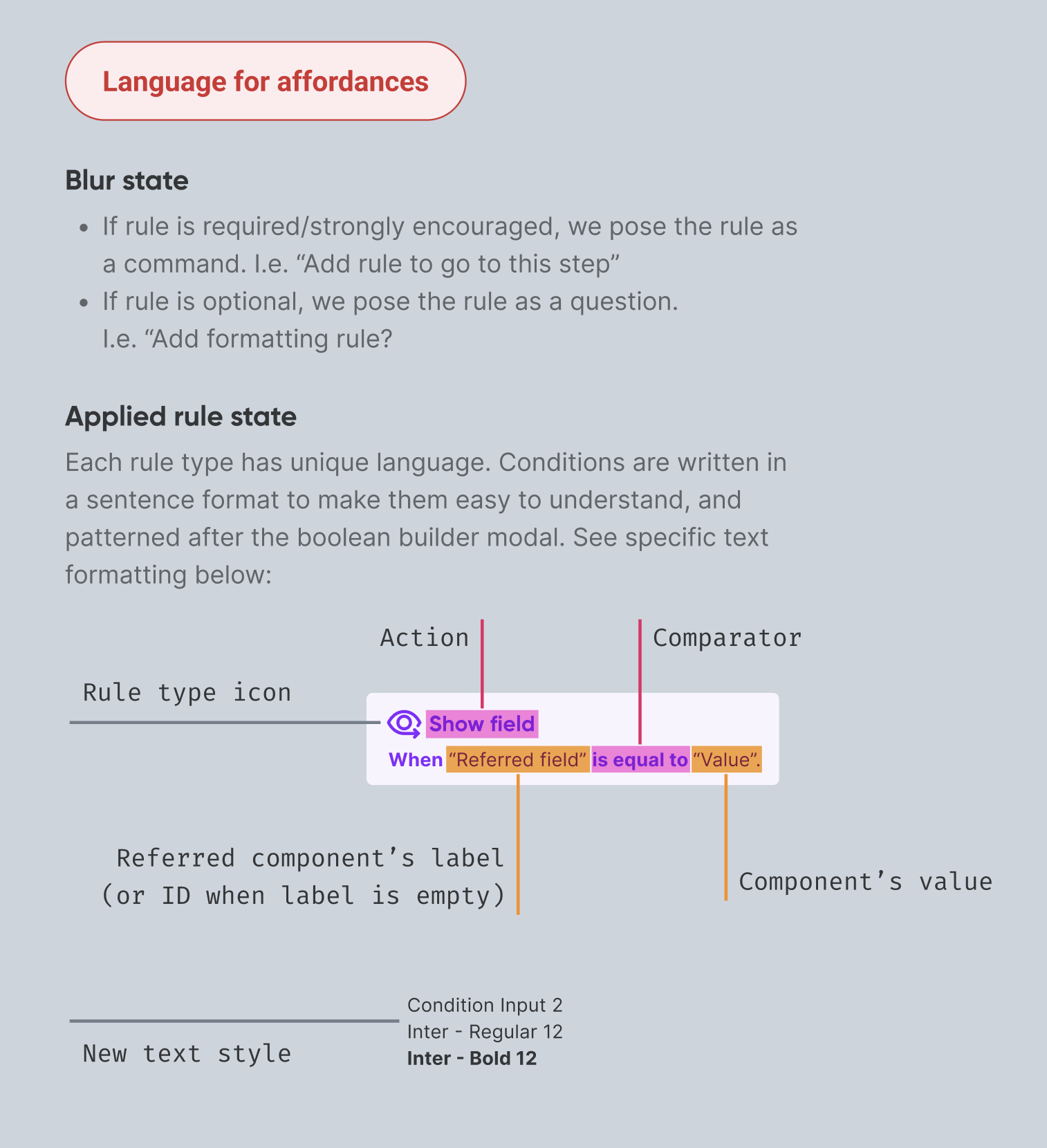
Completed conditions should be easy to read
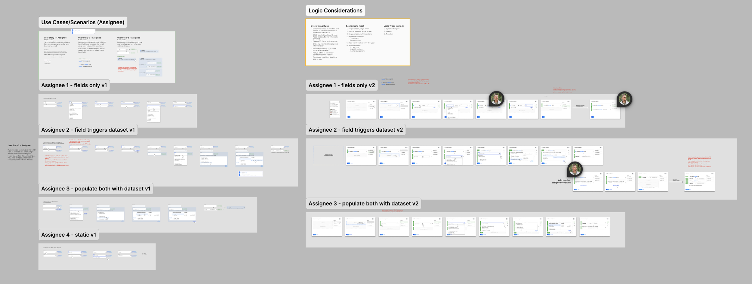
As usual I presented initial design proposals, collaborated live in Figma with my design cohorts to further iterate together, determined new considerations and a design direction, and continued to repeat that cycle. Eventually we split and had Chrissy and I pursue specific logic types. I focused on solving step assigning while Chrissy focused on the boolean builder that would fit most other logics.
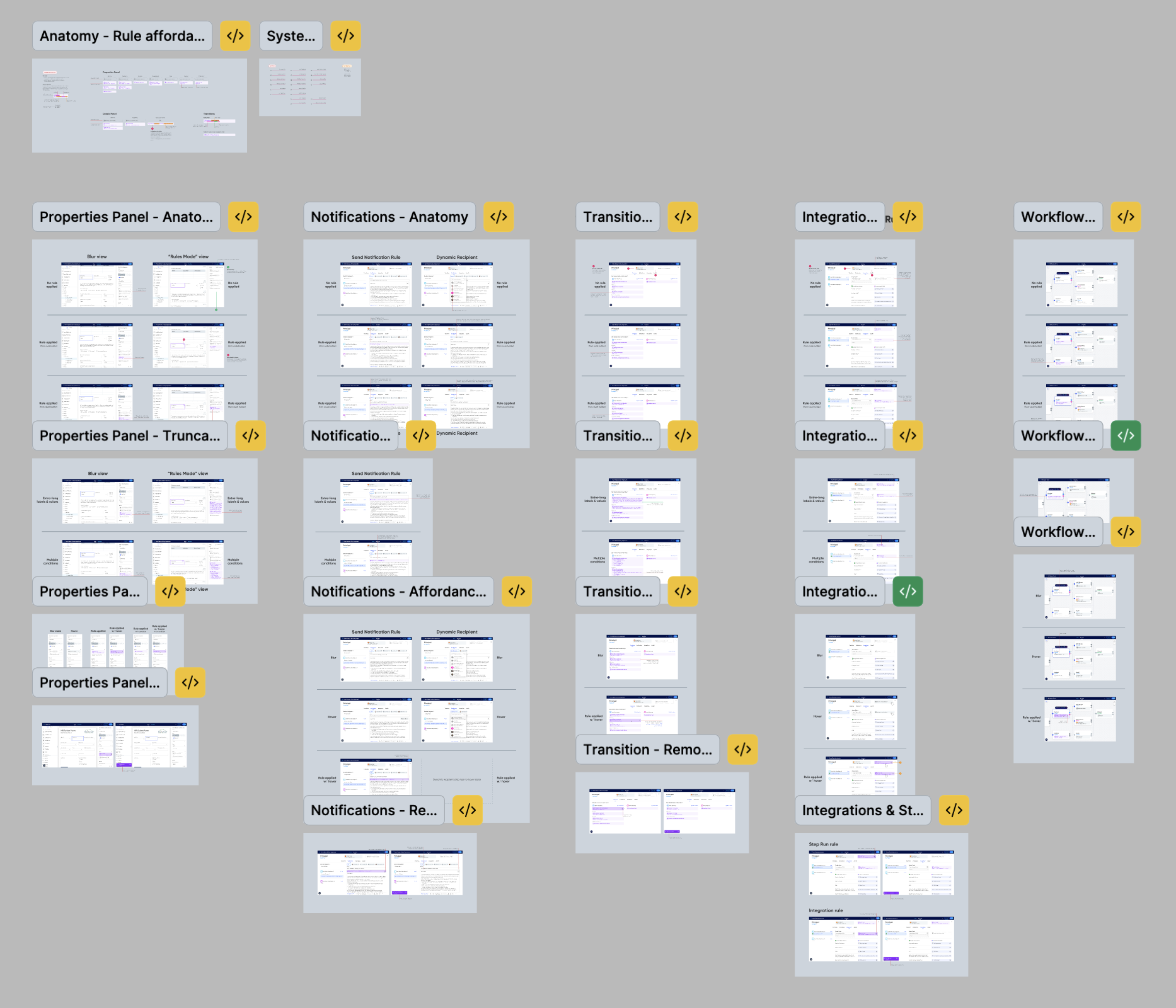
The trickiest part of the whole thing was trying to create a recognizable visual affordance that fit into four different contexts within our builder. Once I had an affordance that worked, I mocked up rough prototypes accounting for each context. These enabled us to see the logic creation experience from every available path.
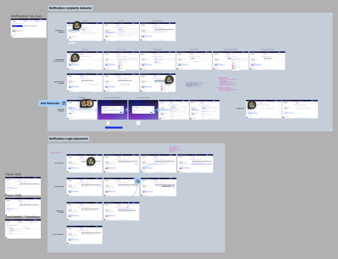
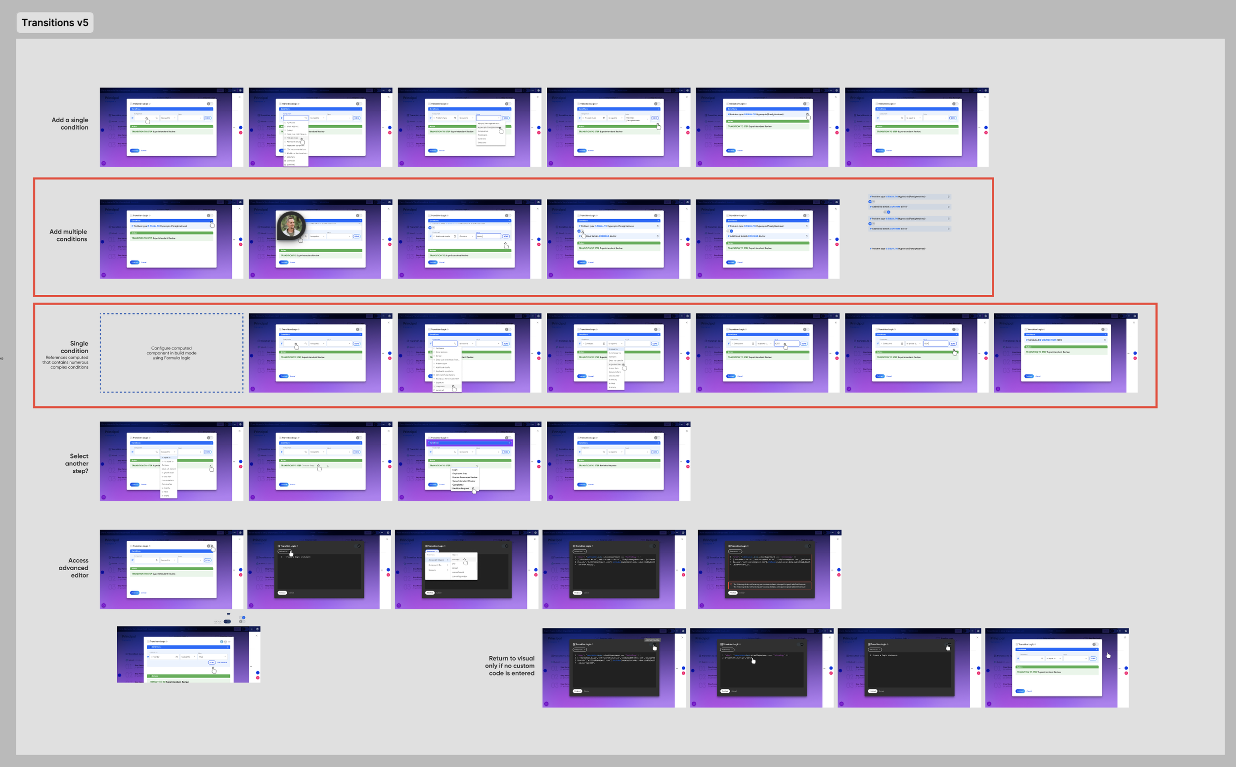
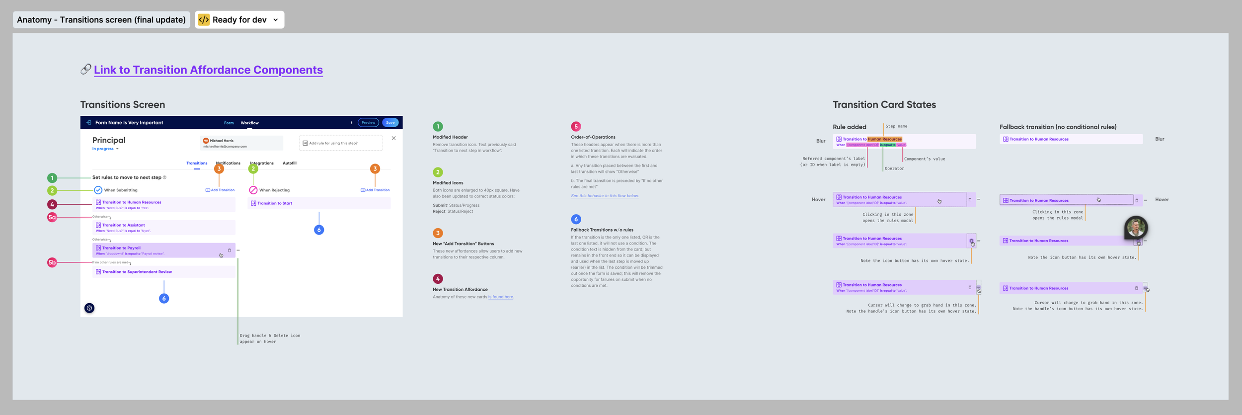
From this we realized these logic affordances would drastically affect our transitions screen and notifications email editor, so I worked on those too. Transitions were complex because we were trying to help users understand where their submission would progress along the workflow, without actually showing them the workflow canvas. I had to account for numerous behaviors like adding transitions, reordering them, switching them to different steps, etc. This took at least three iterations.
The Rule Builder Modal
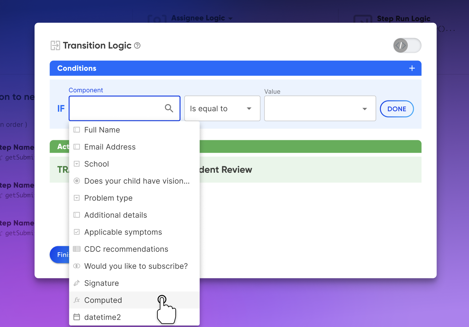
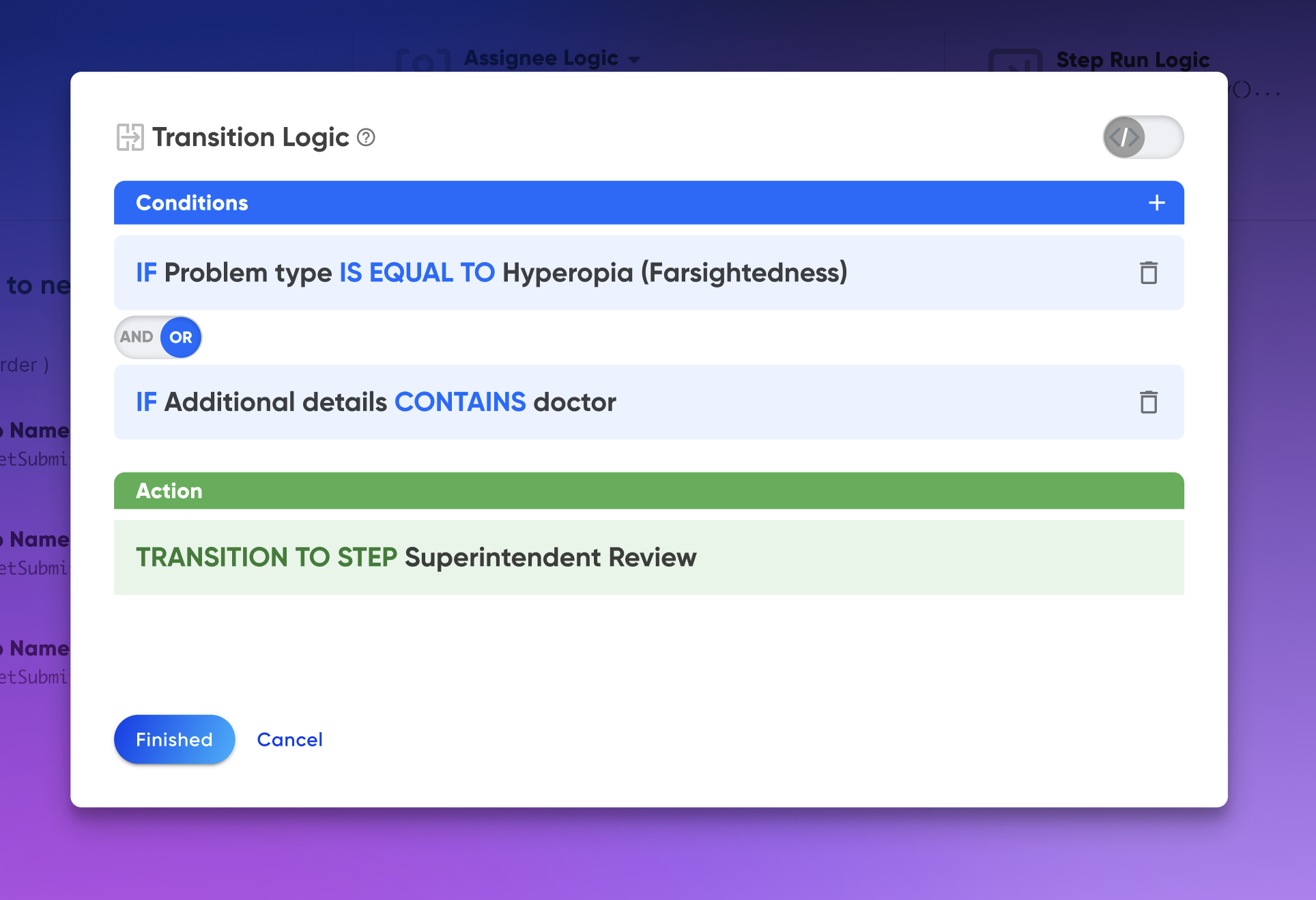
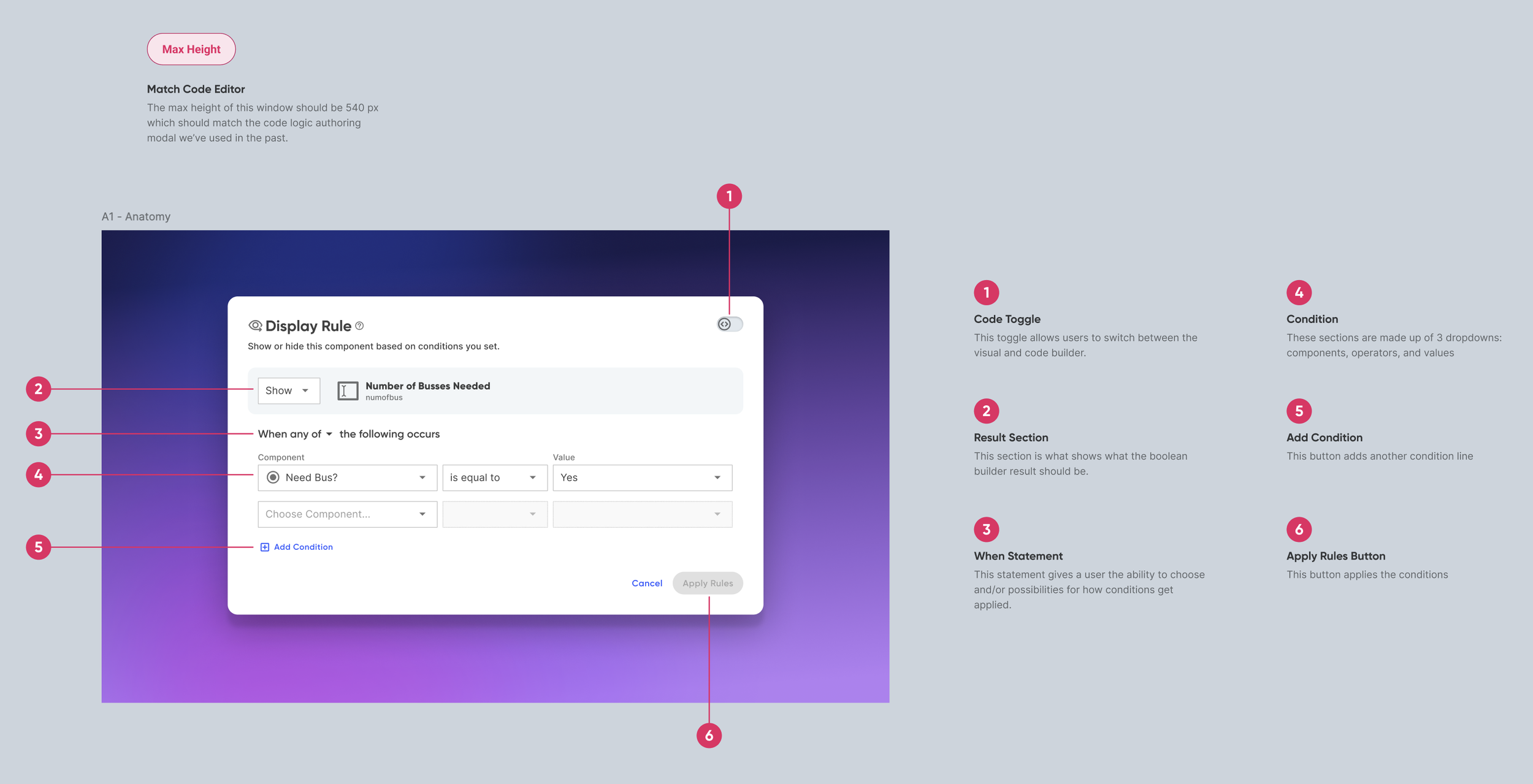
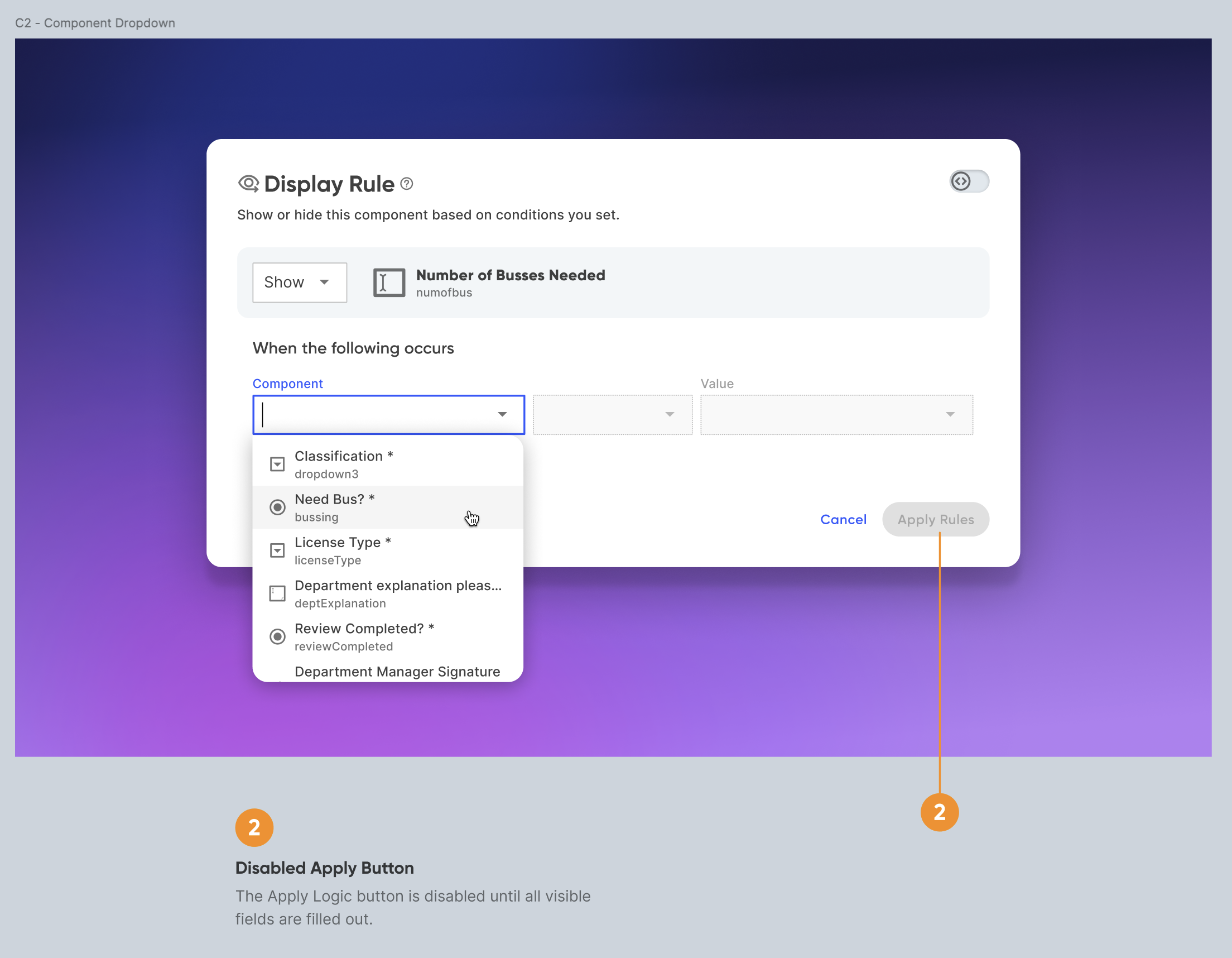
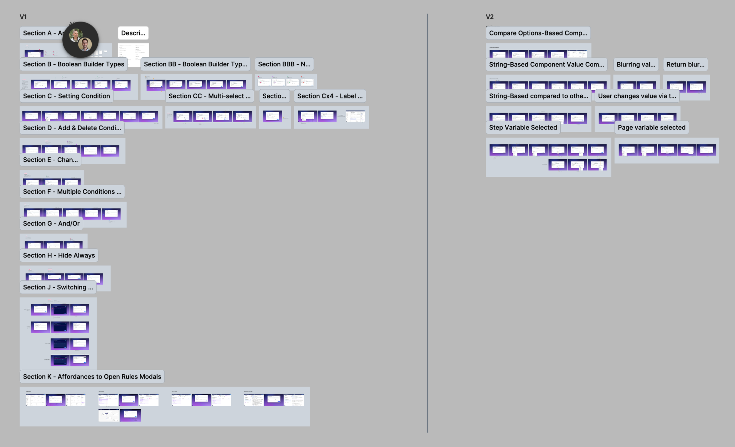
This was the single most important part of the whole user experience: how to create custom conditions. Creating these for each rule type would occur in a modal. This modal’s structure would remain consisent across all rules, with minor alterations if needed. We attempted numerous layouts while comparing how other platforms handled this.
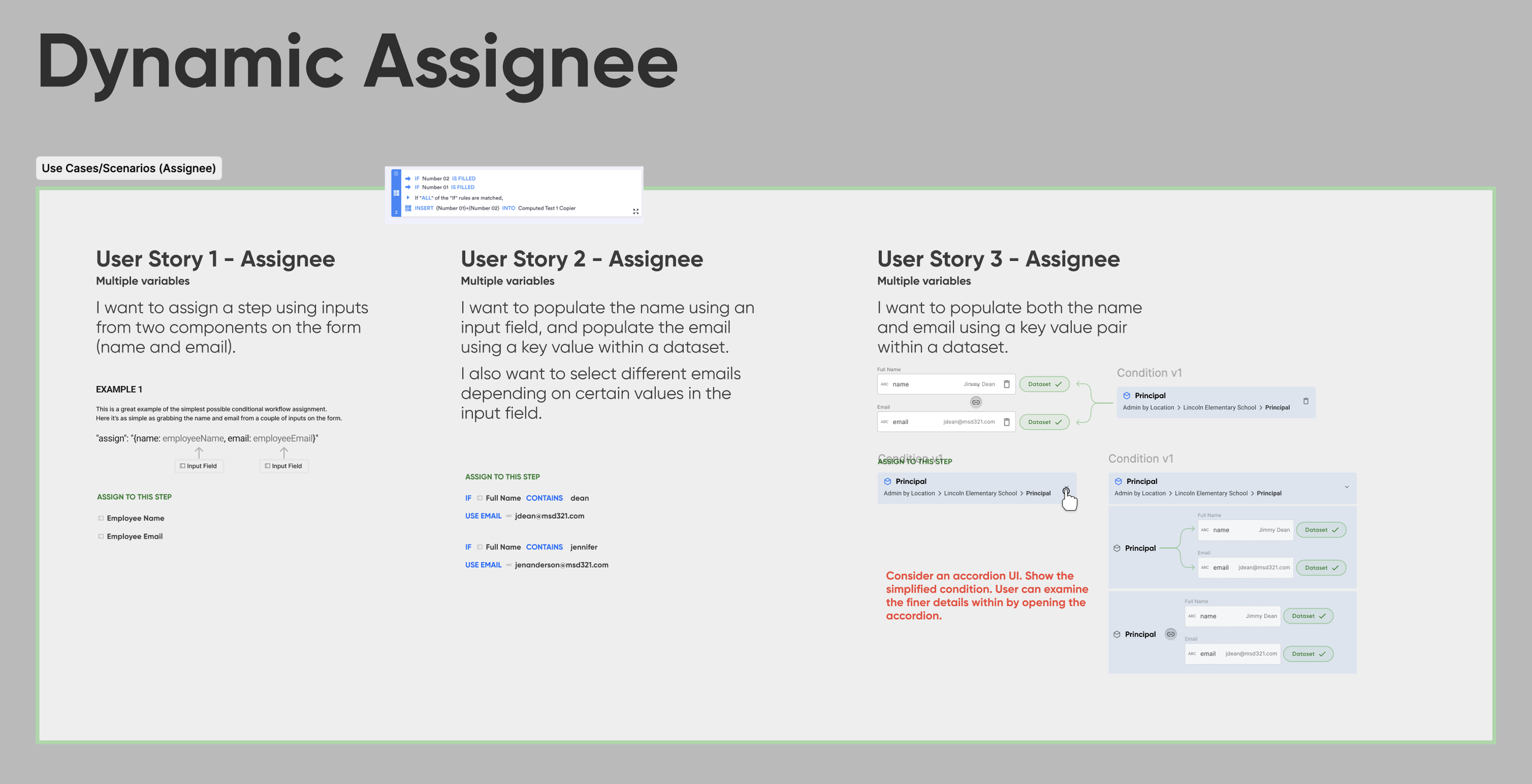
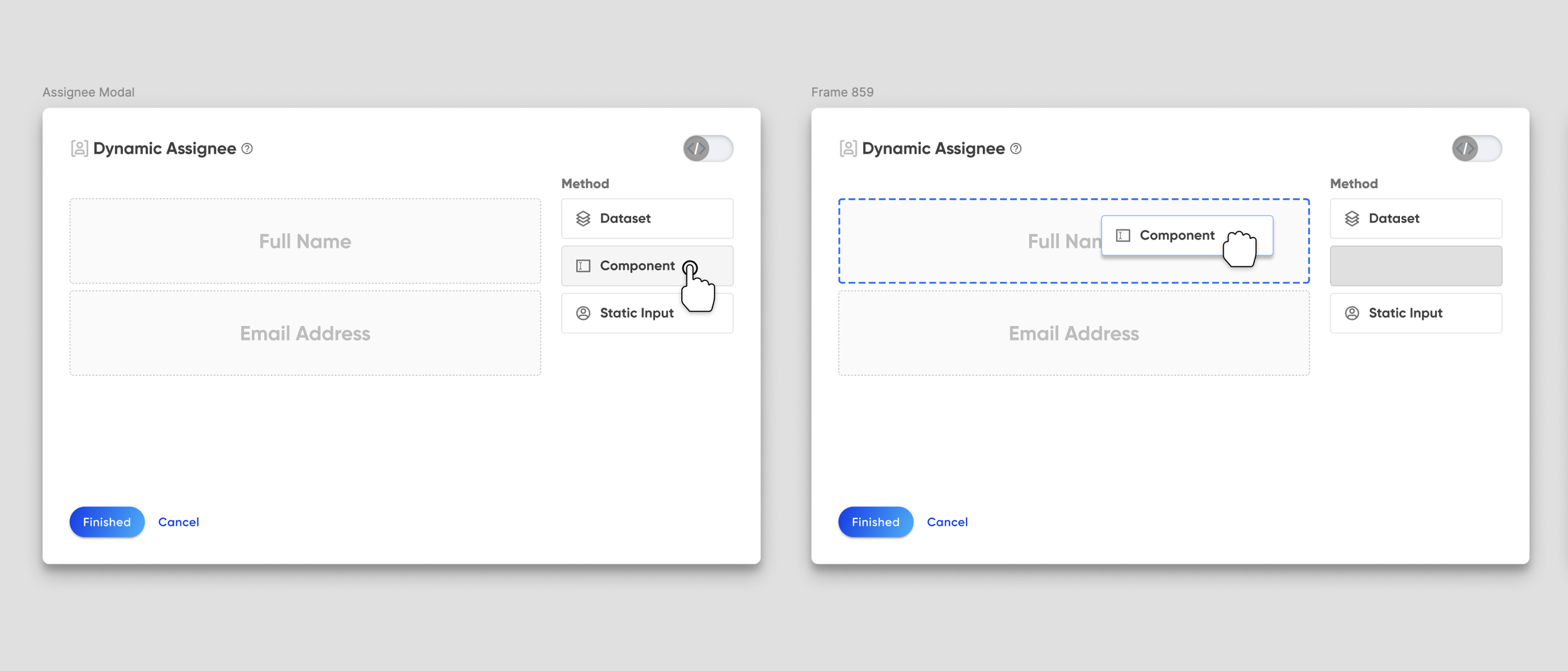
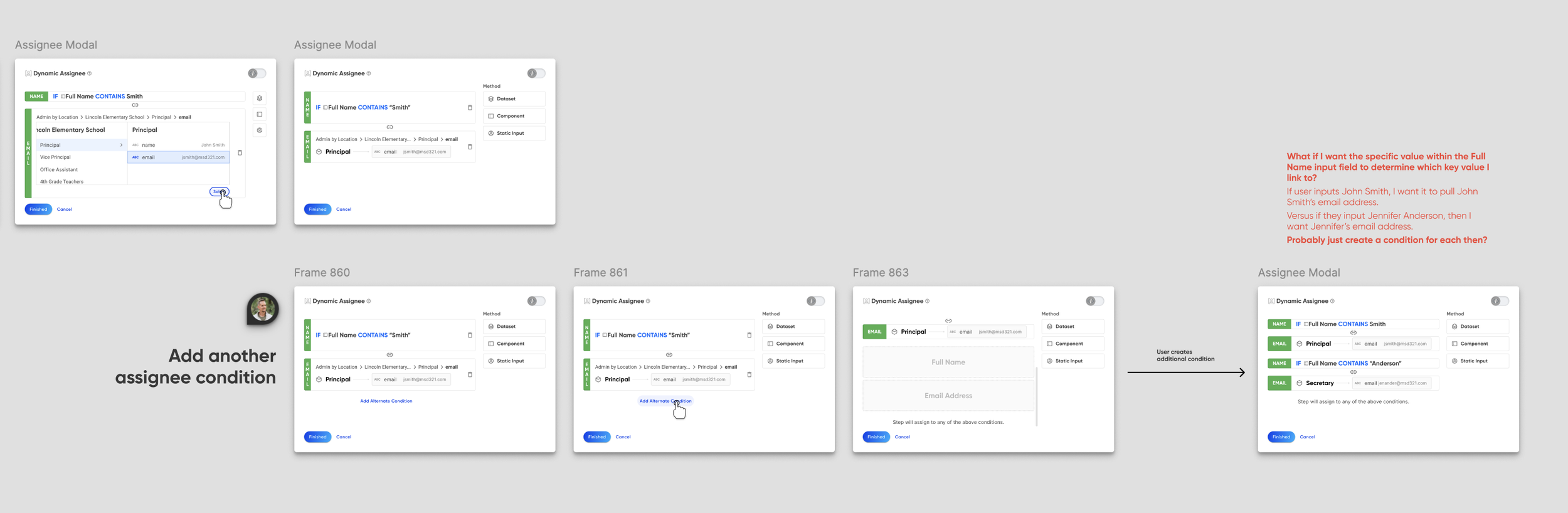
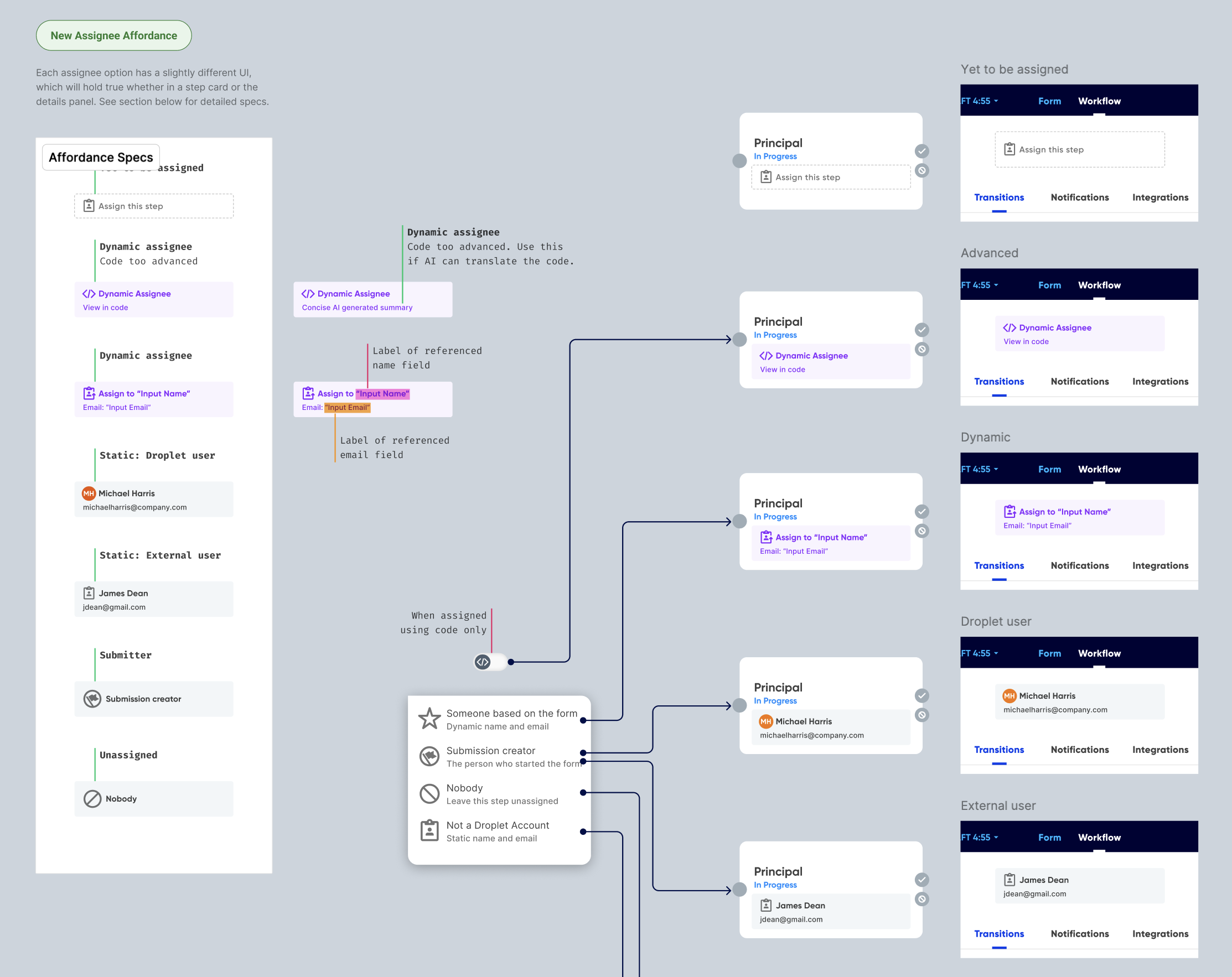
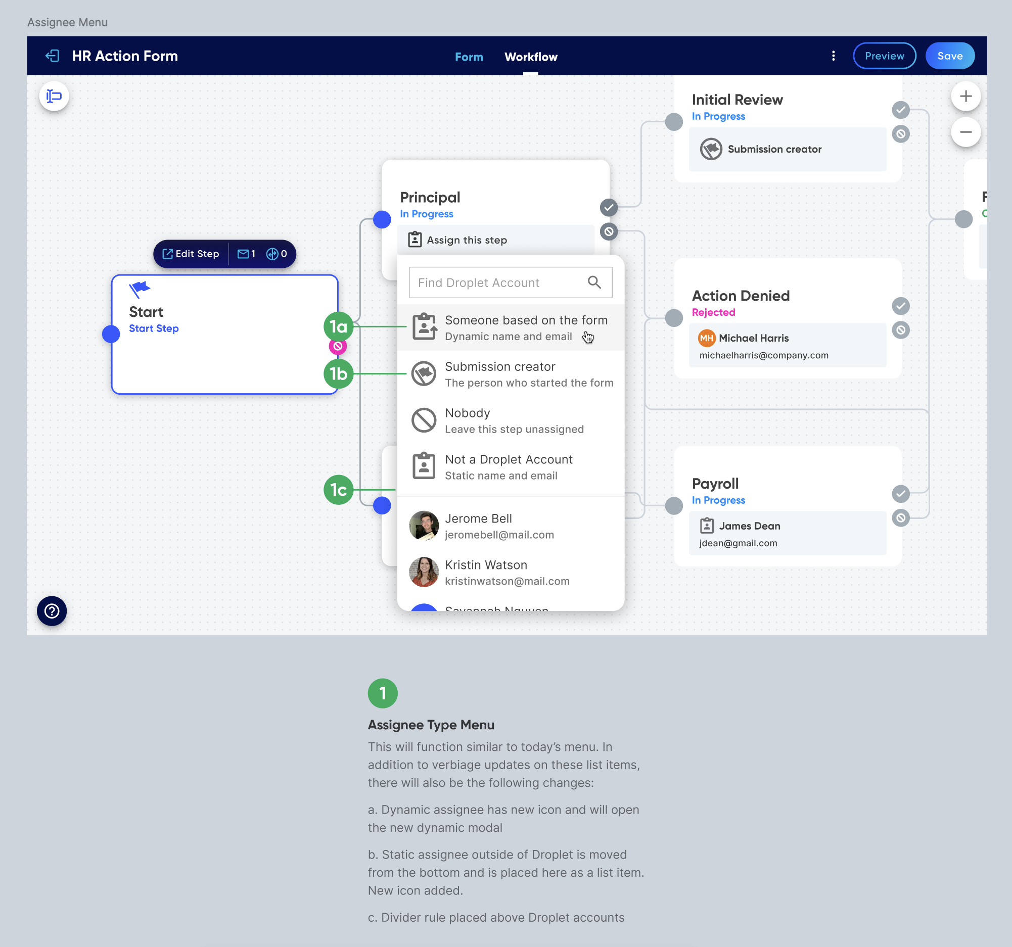
The assigning modal was also a particularly special use case. It differed from other logic types as it had to account for three types of assigning methods:
Manual assignments (entering the name & email yourself)
Dynamic assignments (pulling name & email from an entry on the form)
Submitter (first-classing a shortcut to choose the person who first started the submission)
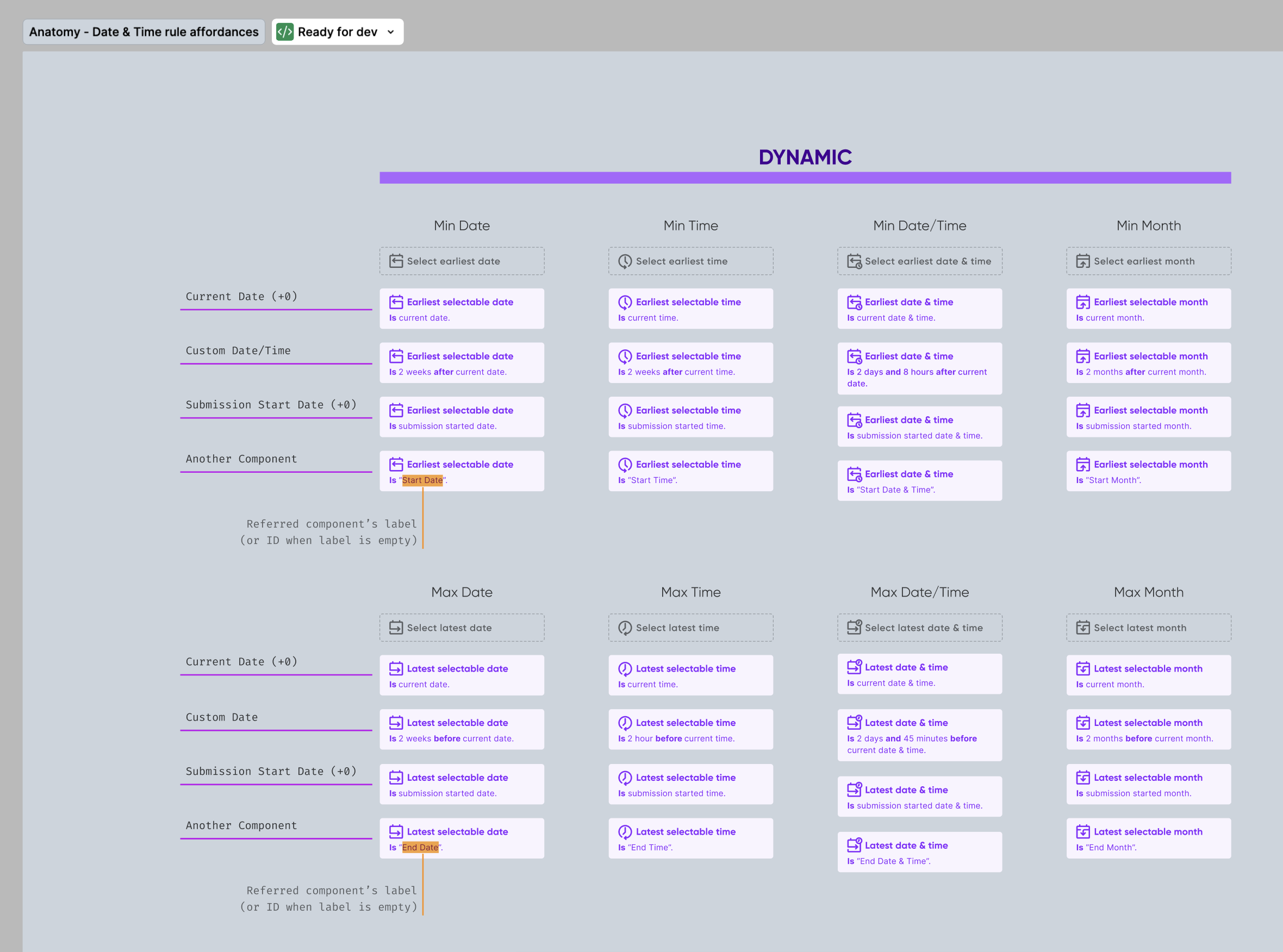
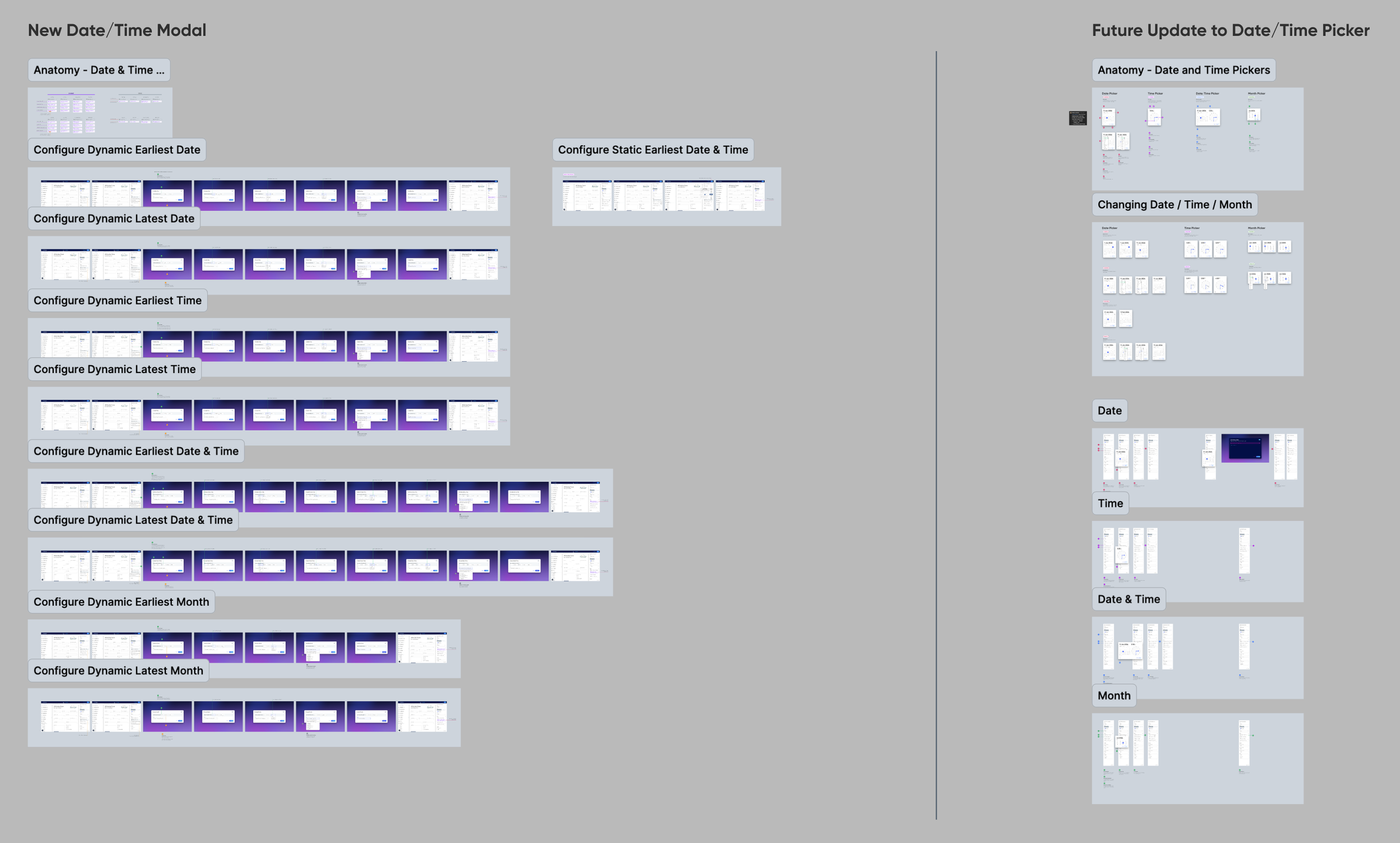
With assigning being so deep, I focused primarily on that while other designers continued figuring out the boolean builder modal. In addition, I also dived into dynamic date & time rules. This was tricky having to wrap my mind around various time references (min date, max date, combining dates and times, etc).
Bringing It All Together
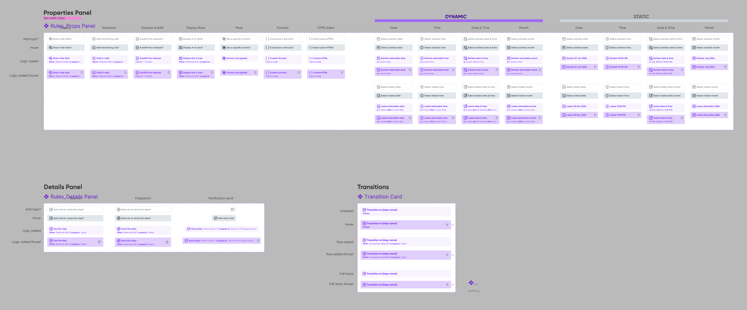
By this point everything began to coalesce. We’d considered every context, which informed the aesthetic as a whole. We accounted for the most commonly used rules, reviewed and tested these experiences for months, debated long and hard, and were finally ready to begin handoff. I created our master file and broke out designs into eight pages. Each flow and anatomy was thoroughly annotated and organized in an easy-to-follow fashion.
Handoff & Further Iterations
Once handoff began, engineering provided a plethora of insights and feedback. Here are some noteworthy changes:
Streamlined language across affordances
Improved notification recipients
Delineated dynamic date & time rules from static rules
Rules Mode
User Story: As a form builder, I want to see every field on my form that has a rule applied to it, and every rule that could affect another nested within it.
This was tricky for two reasons:
Fields are automatically nested within containers, which themselves can have their own rules applied
Our click model requires users to use the “tree” (layers panel) to select containers
I wanted it to be obvious which rules affect others nested beneath them.
Final Deliverables
“The new Show/Hide feature is so nice! It made me not have to think. 😂”
Retrospective
What Went Well
Researching the conditional logic builders on competing platforms made all the difference for me. Once I saw the various solutions used to address this kind of problem, it helped clear a lot of noise in my brain.
Breaking up design tasks across three designers allowed us to iterate on this much more quickly. There was a lot of design work needed, and continuing by myself would have been overwhelming.
What Didn’t Go Well
I feel like I spent a lot of time in early phases just running around in circles. It didn’t occur to me until later to look at existing boolean builders on other platforms. I just didn’t know these things even existed, which really slowed my progress.
I focused too much on trying to figure out how to work with datasets. Trying to translate the concept of making conditions truly dynamic into a visual interface was just too much to handle without an existing visual boolean builder.
Handoff was a bit staggered at the start. We weren’t able to complete a cohesive single review with Engineering, and some of our designs ballooned. This meant the following weeks were a grey area of “what’s actually finished?” mixed with “what’s still in progress?”
Future Improvements
If there are comparative designs out there worth investigating, I’ll research those early on to help me get more oriented.
End Credits
My fellow collaborators: DJ Misurelli, Head of Product // Jay Wilkinson, Senior Product Designer // Chrissy Andreasen, Senior Product Designer // Skyler Hair, Chief Technology Officer // Nick Duell, Subject Matter Expert // Chad Donohue, Software Engineer // Jeff Nordlund, Senior Engineer II // Matt Stauffer, Software Engineer
Like what you see?
Please reach out to me! You can find my information on my contact page.