

Visual Form Builder // Droplet
UI/UX Design Project
“While Droplet has some competition in this space, I find Droplet among the best in design, user interface, and functionality.”
Stacks of paper up to your eyeballs
Picture it. You take a seat at your desk. It’s nearing the beginning of the new school year, and you are stressed to level ten! Not only have you got to help shuffle paperwork for over a thousand students, but you’ve got to make sure each document routes to the right people in the right order. But what happens when there are anomalies? Someone has a special need, or qualifies for a program someone else doesn’t? How do you track down people who haven’t filled things out by the deadline? The task ahead is daunting, and ever present because this is just school registration. There is always more, like a giant river of information ever flowing over the banks of your office. God be with you.
I collaborated with my product team to produce this video for Droplet’s annual company onsite. I recorded all narrations, created all motion graphics, and edited the video together.
This is what began Droplet’s quest to help digitally manage the flow of information for K-12 schools. We do that by digitizing forms and automating workflows. Take a look at this promotional video we produced to give you an idea. From the beginning, the act of creating digital versions of forms was performed by our Implementation team, who provided the forms to our clients. However, the demand for clients to have a self-serve option for building forms became our biggest request.
From the beginning, the act of creating digital versions of forms was performed by our Implementation team, who provided the forms to our clients. However, the demand for clients to have a self-serve option for building forms became our biggest request.
Let’s talk business needs
This Visual Builder was critical to the continued growth of Droplet. We had numerous contracts (to the tune of over $200M) waiting on this tool. To make the builder robust enough to meet the needs of our users, it required these major features:
A layout builder where users could drag-n-drop form components onto a blank canvas
A workflow builder. Here, users would map out the steps a form should take to ensure any required contributors are included and notified in the proper order.
Permissions configuration. This would determine what a contributor would be able to see and interact with during their designated step.
So Who Is This For?
We referred to the poor soul you met above as a “Citizen Developer”. In short, this was an individual who, despite no formal background in software development, created or modified applications, software, or other digital tools to meet needs within their organization or community. They were the ones in the trenches, assembling information and then putting it all together by building a digital form, powered by a smart workflow and supported by custom datasets.
A (Chaotic & Messy) Process
Given these needs by our citizen developers (and by extension Droplet’s business needs), these were the areas where I made major contributions:
Builder components properties panels
Visibility mode
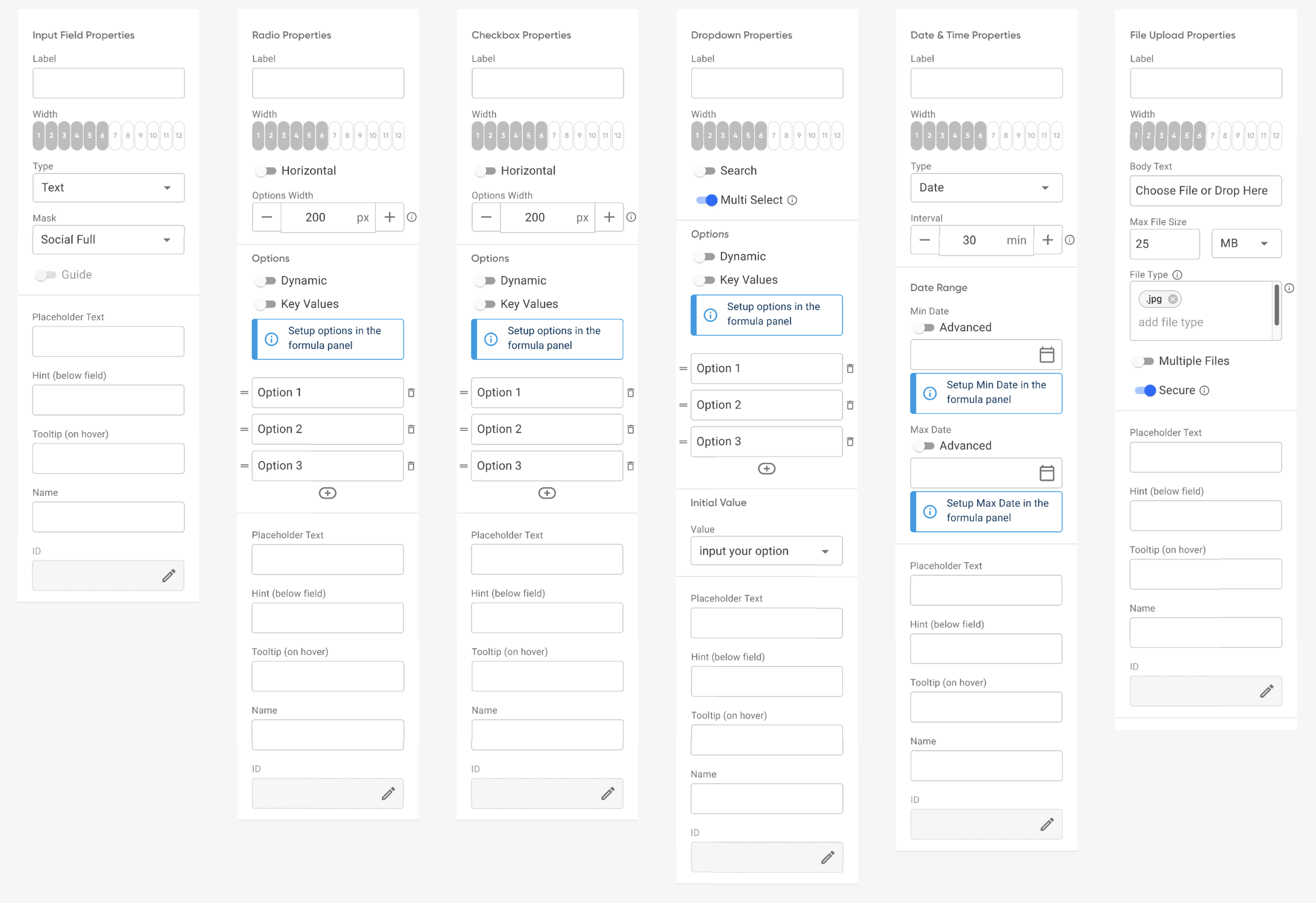
Where I begin: Builder components properties panels

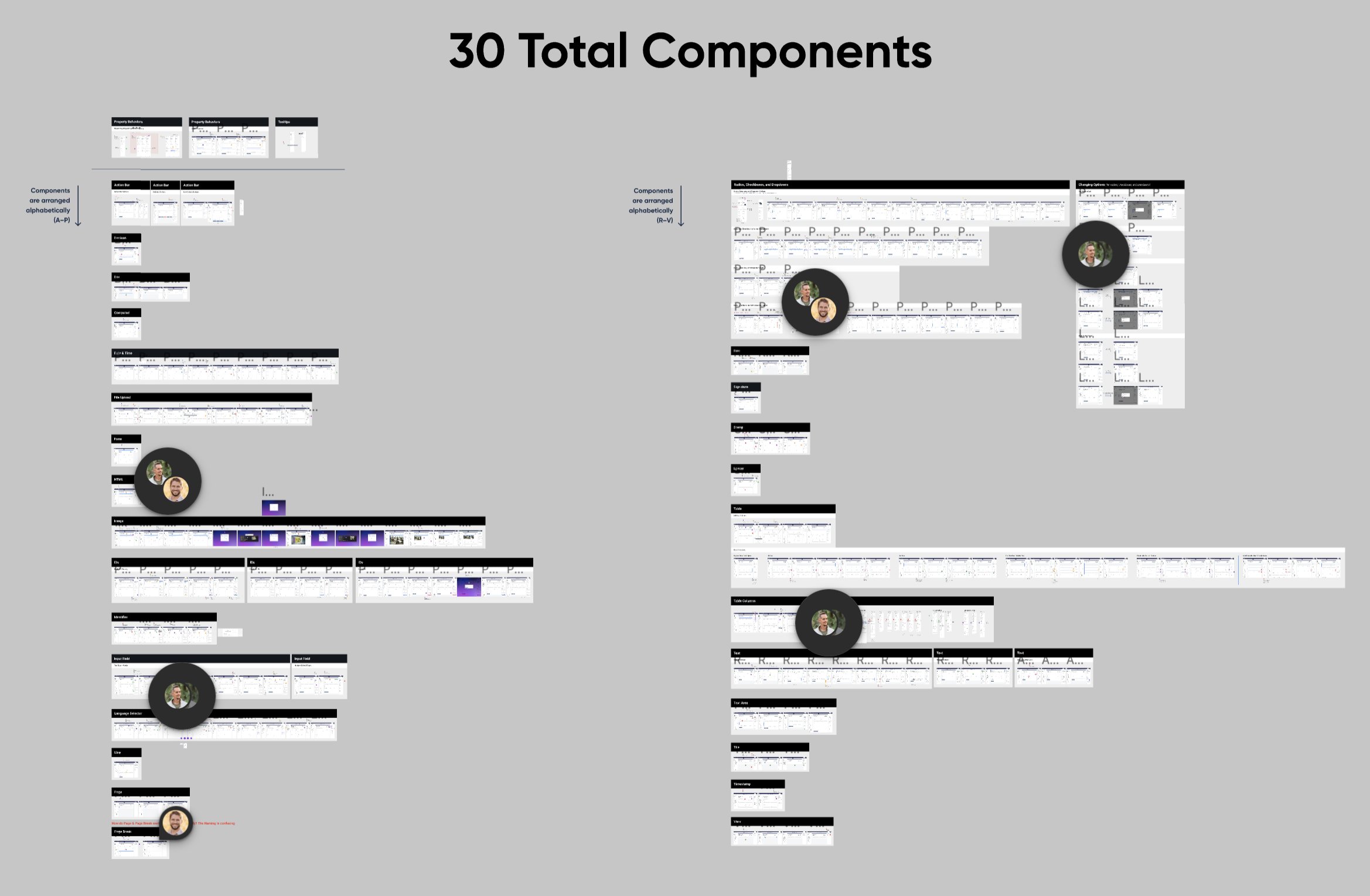
Here I enter the picture mid-stream. Our Head of Design, DJ, and Sr. Product Designer, Jay, has already laid the groundwork for these panels. They had designed the interface for our visual form builder, but were lacking a critical piece: Property panels for each of our 30 builder components. My task was to:
Obtain all properties needed for each component
Design flows exemplifying the behaviors of each property
Ask the expert
I consulted with Matt Stauffer from our Engineering team, and Skyler Hair, Droplet’s co-founder and our CTO. Together they provided the details of each property. DJ had already established an overall structure for the panel, so I built on to that and tailored it to each component’s properties.
Wash, Rinse, Repeat
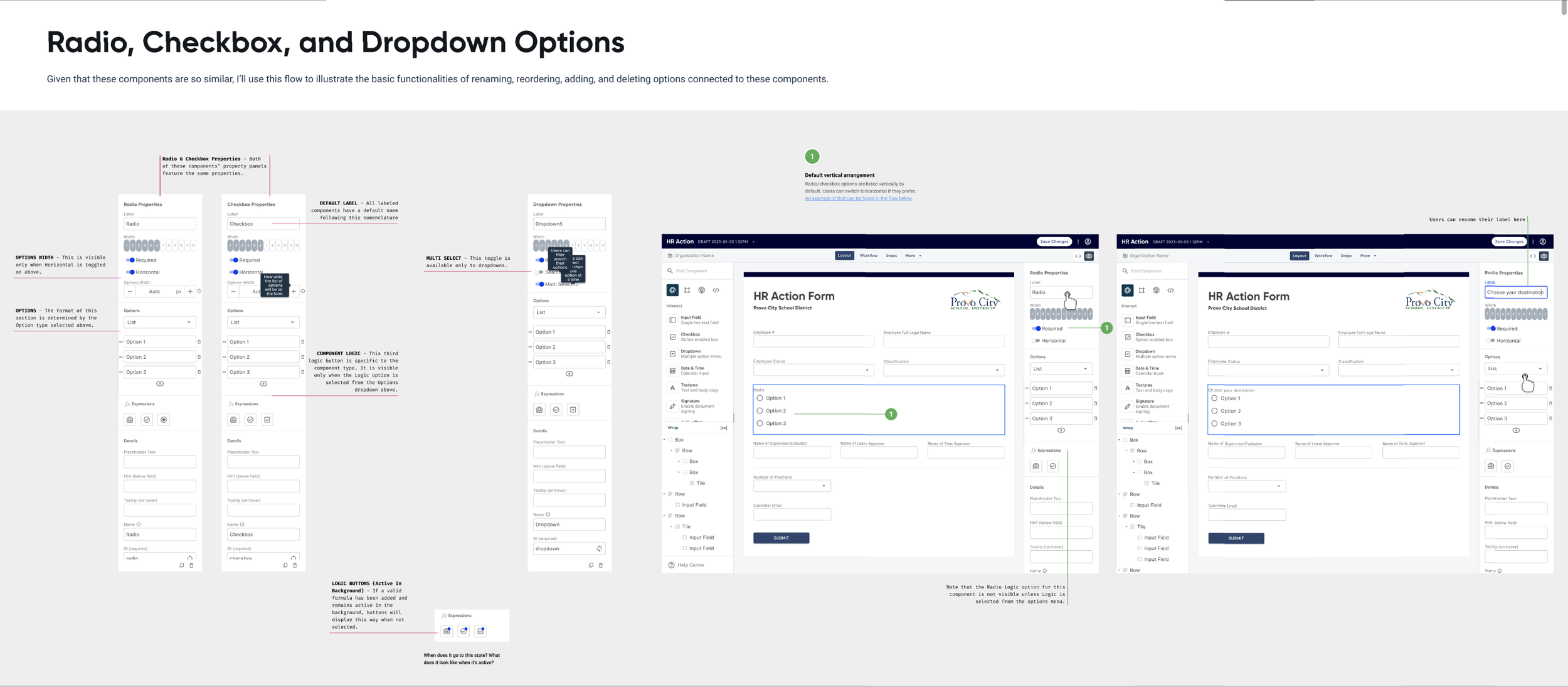
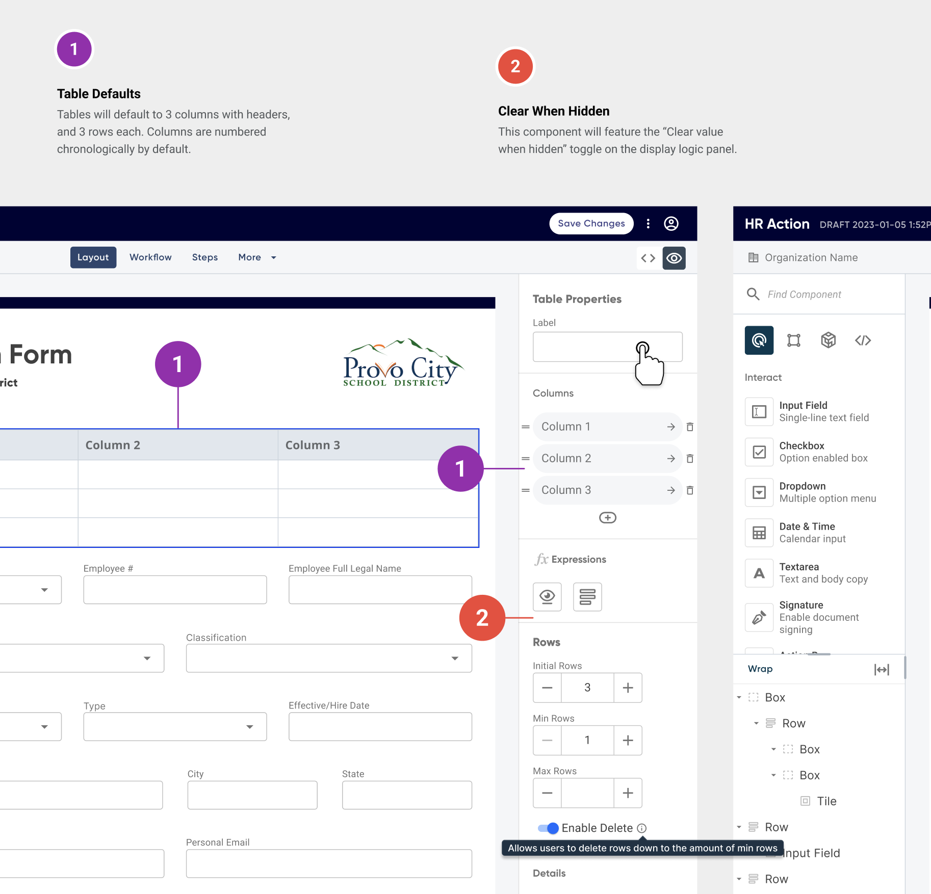
While components shared many similar properties, each possessed certain unique properties and behaviors. For example, Radios, Checkboxes, and Dropdowns could all be populated using datasets, while Tables require the ability to limit input types in certain rows/columns, etc. Each presented their own challenge.
To illustrate these behaviors, I mocked up flows for each component and their pertinent properties. After numerous reviews and iterations, we finally accounted for all necessary scenarios.
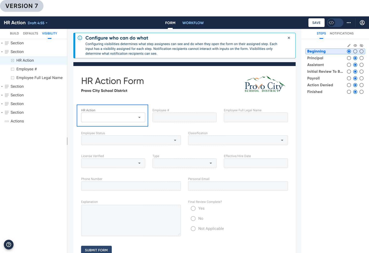
Visibility Mode
Visibility Mode answers the question, “Who can do what at a given point in a workflow?” For context, you must first understand the function of a workflow, which is encapsulated in this user story:
As a school administrator, I need to map out the chronological steps a form will take so that I can assign necessary contributors to complete the form.
To encapsulate what Permissions do, here is the user story:
As an admin building a workflow, I want to designate what assignees can do on their given step so that sensitive information is not accidentally disclosed.
How is this supposed to work?
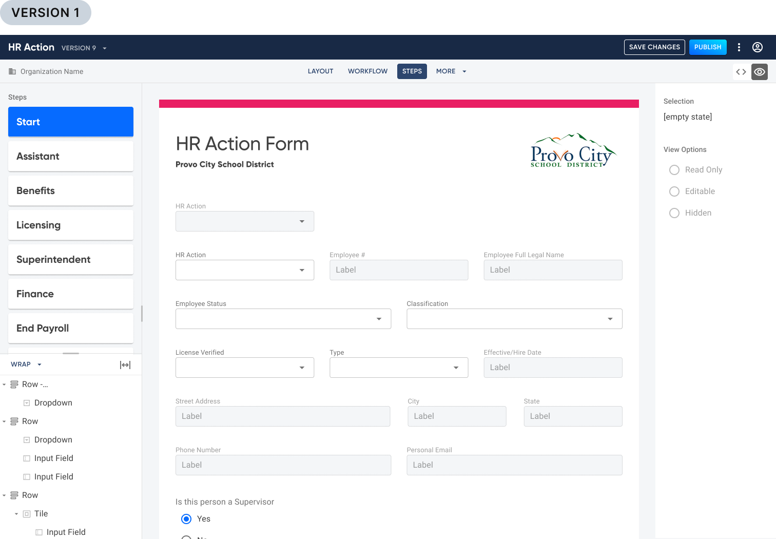
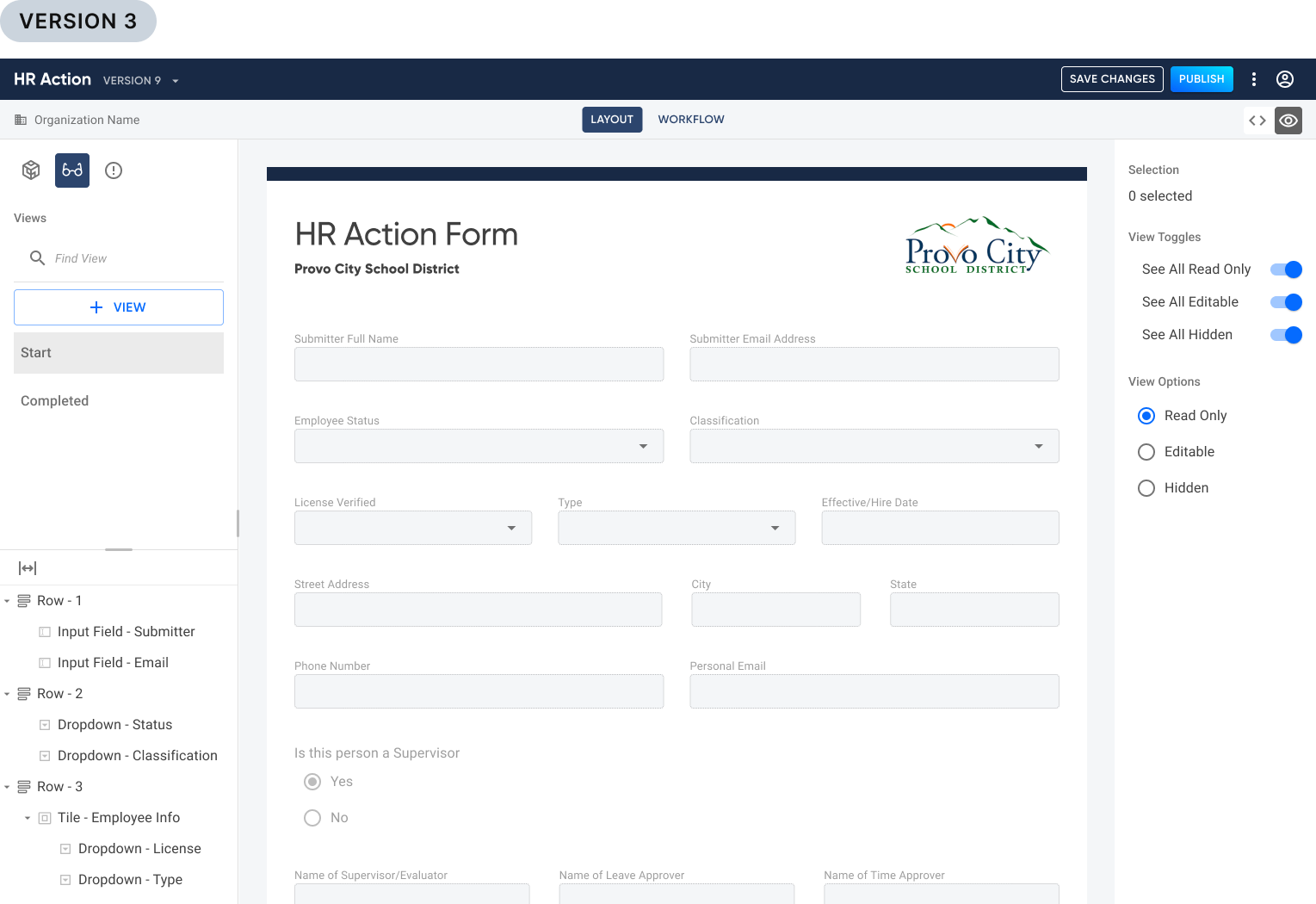
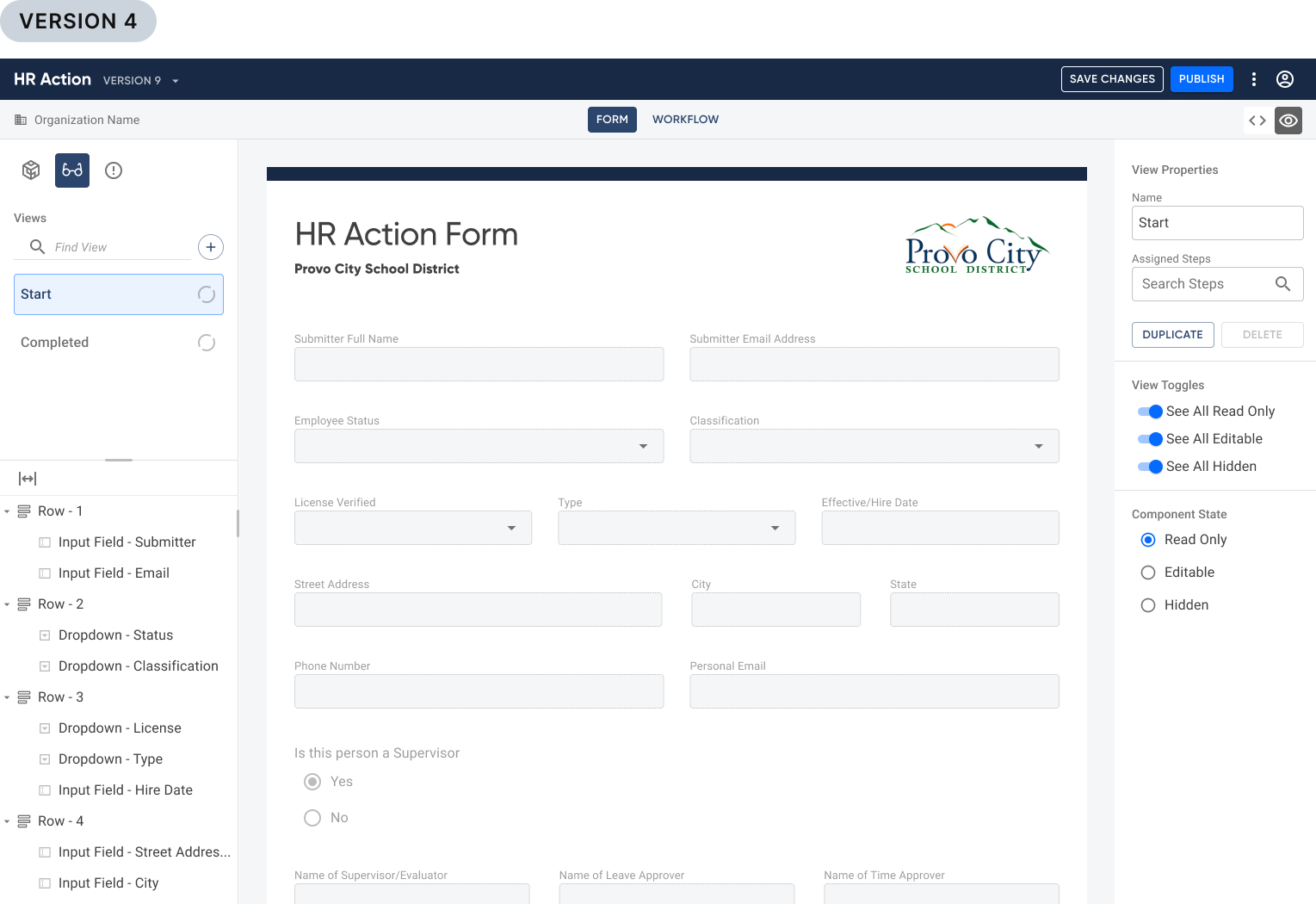
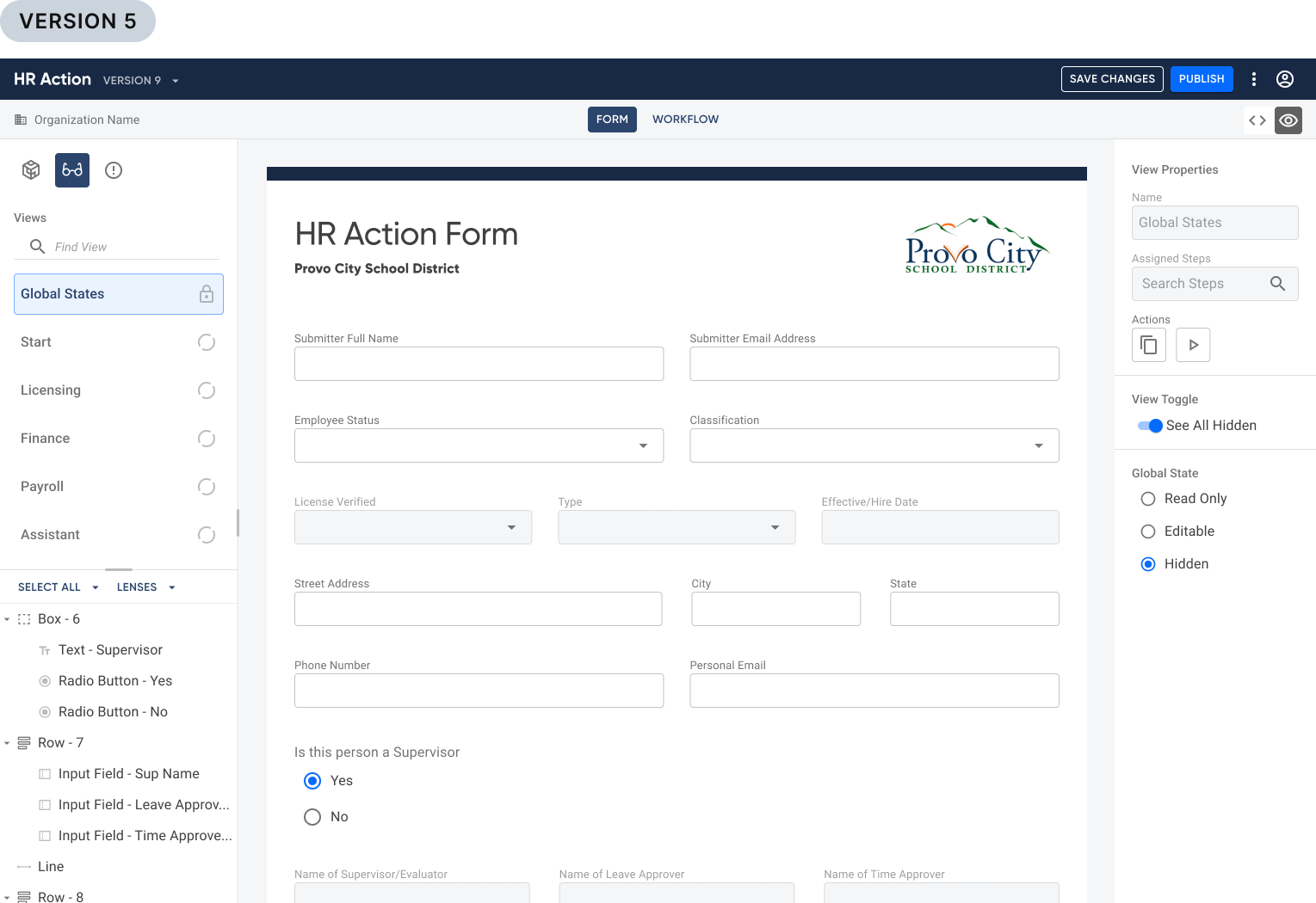
Our paradigm surrounding Permissions evolved as we worked on this. Originally, this function was referred to as *“Step Permissions”*. As we began discussing the integration of this function into the new builder, we changed the paradigm to what we called *“Views”*. These Views would be created and configured separately from the Workflow steps. Within a View, users would select form components and set them to either:
Editable
Disabled (read only)
Hidden
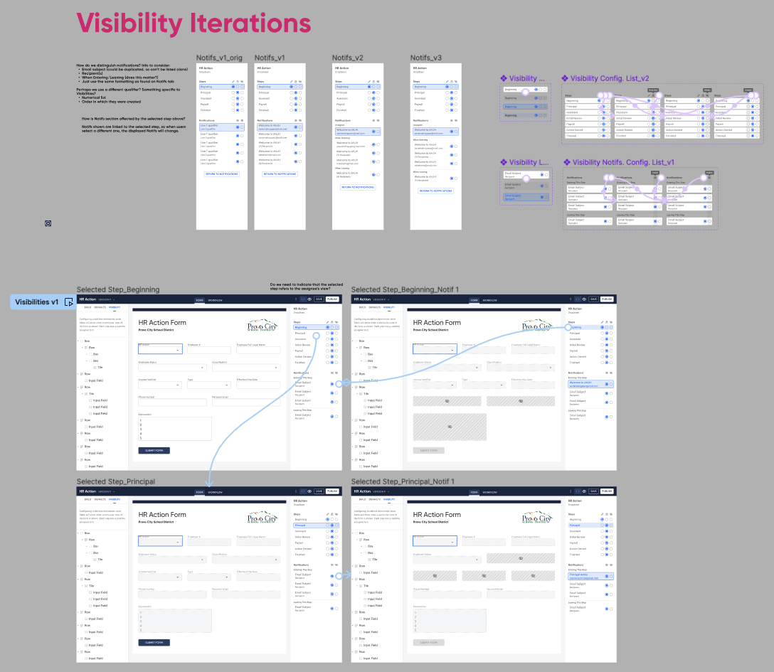
I struggled to wrap my mind around the relationship of a View, and why it had to be separated from a Step. In my mind, the Step should be the View and there shouldn’t be any designation between them. But at this stage it was requested that we keep them as separate and distinct entities. To help me understand the progression a form takes through a workflow and its accompanying Views, I wireframed an example of how the Views of a single form may appear as it progresses through the Workflow.
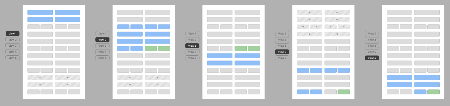
Okay, I think I’m getting it now
This led to five iterations that built upon this model. With each iteration I reviewed designs with the team, allowing us to uncover additional functions and affordances to mock up, things like:
Multi-selecting components
Preview mode
Using parent containers to override nested component states
Read Only default setting versus Editable on all components
Error states
I found prototyping to be essential when trying to communicate the intricacies of Views. Over a period of three months I iterated over 14 times, eight of which were prototypes.

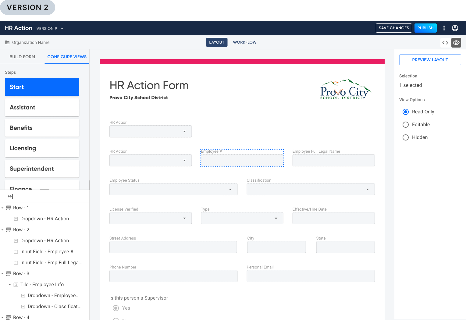
The paradigm shifts
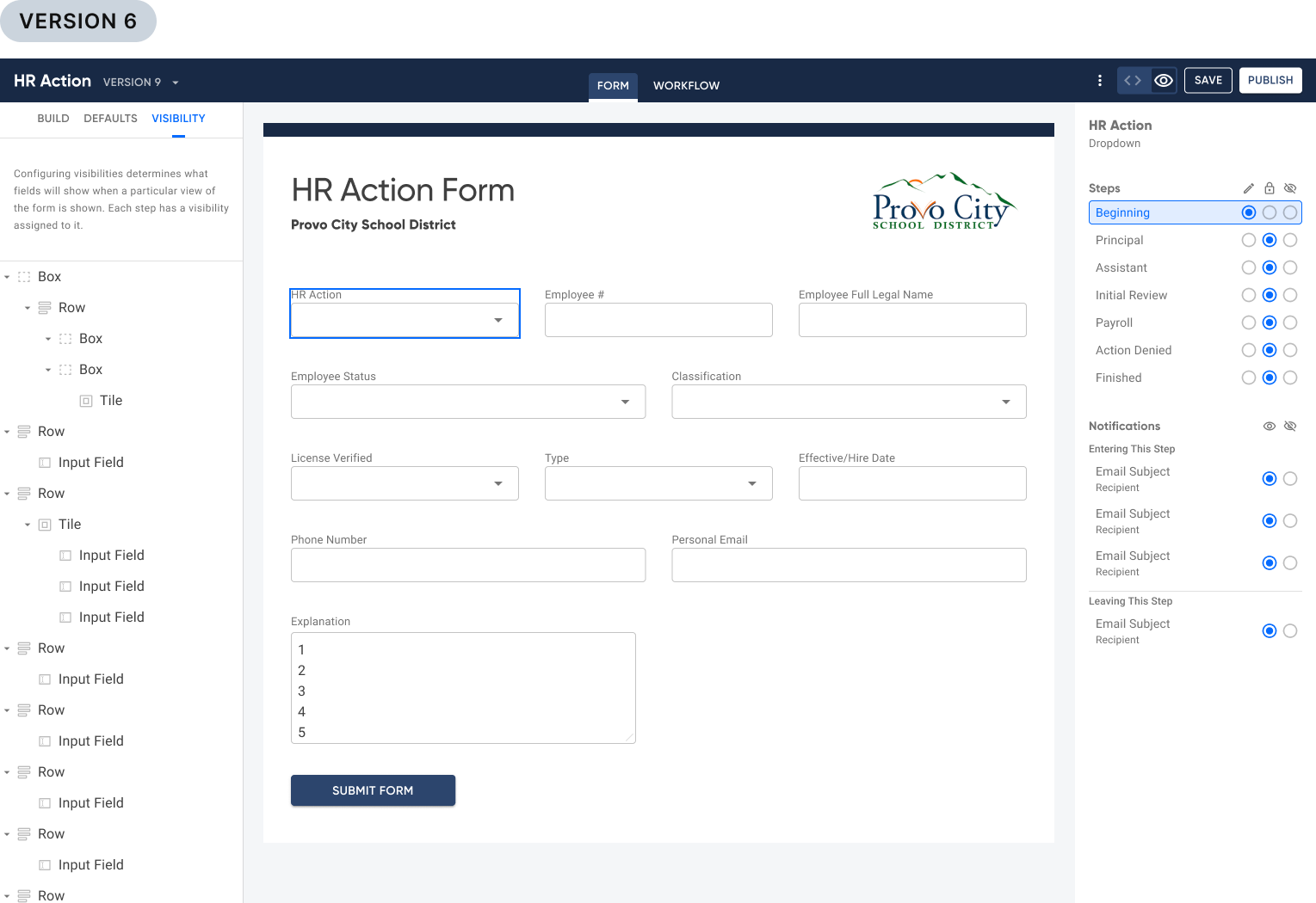
Over the course of these iterations, our paradigm around Views began to shift. The idea of combining Views and Steps so that they functioned as a single entity began to catch on. And the nagging question as to exactly where this mode should live was a constant debate. Did it belong in the Form builder? Or in the Workflow? This wasn’t always clear given that it acted as a sort of bridge between both builders. Eventually we concluded it should function as a mode within Form builder alongside two other modes, Build and Defaults. We also gained consensus around using the name “Visibility”, rather than Views.
We really ought to test this
Long overdue, I pushed for us to perform usability tests. While preparing iterations for this, we discovered that a matrix would be the best affordance allowing users to:
See the permissions configuration of a form on any step
Access to see and select all steps
Set global (cross-step) permissions with a single click
Configure permissions for notification recipients
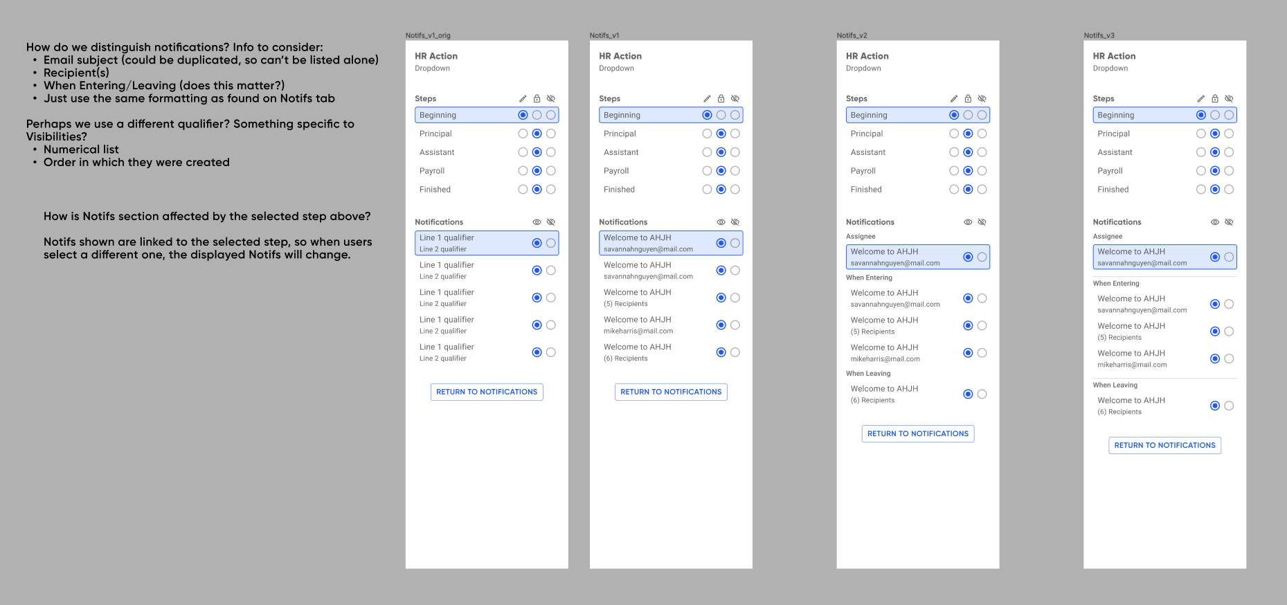
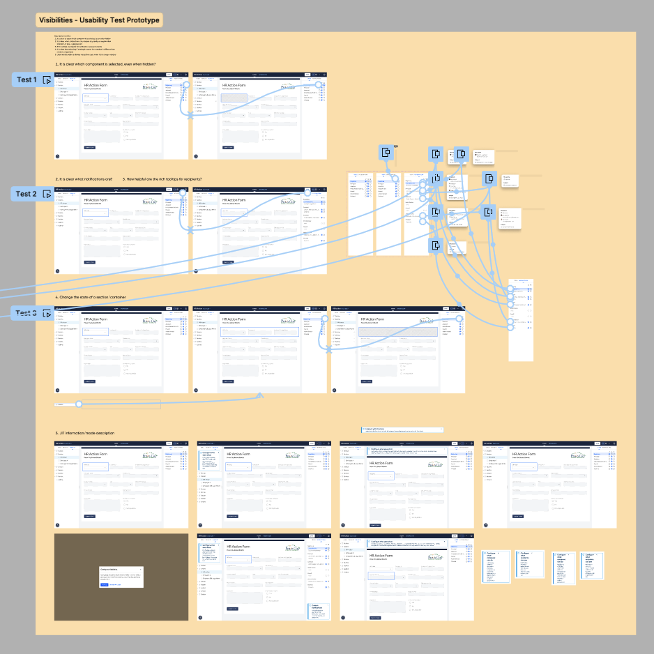
I performed remote usability tests with existing clients of ours. Sadly, we have lost record of our findings from said tests, however I do know what changes they led to:
Separating step visibilities (for step assignees) from notification visibilities.
Simplifying the matrix so that the label tells us only who will be seeing this configuration
Adding rich tooltips on hover states so users can see more detailed info associated with that visibility
Final Deliverables
Business Results
Completion of the properties panels and step details panel, plus the addition of Visibility, were keystone pieces of our visual builder tool. These paved the way for unlocking contracts valued at over $150M in total, and made us a prime competitor in the space of digital form building software.
Retrospective
What Went Well
My component library became extremely helpful in keeping consistency throughout all design elements.
I built each screen utilizing Figma’s auto-layout, thus allowing the content of each screen to be automatically responsive to changes and iterations. This improved my workflow.
What Didn’t Go Well
We could have tested earlier, and more often. The majority of our design decisions were made on data gathered during the two years prior. While this did answer many of our questions, it did not fully inform all decisions to the degree we needed.
Future Improvements
Wait to employ auto-layout. Because we started using it early in the process, it became a time-suck trying to navigate around it while iterating on new designs.
End Credits
My fellow collaborators: DJ Misurelli, Head of Product // Jay Wilkinson, Senior Product Designer // Chrissy Andreasen, Senior Product Designer // Skyler Hair, Chief Technology Officer // Matt Stauffer, Software Engineer
Like what you see?
Please reach out to me! You can find my information on my contact page.