

Design System Revamp // Droplet
UI/UX Design Project
Chaos, Chaos Everywhere
As the proverb goes, “cleanliness is next to godliness”. Even the big man upstairs said, “Mine house is a house of order”. Naturally, our processes and the chaos of creating generates a flurry of cluttered designs like sawdust in a mill. But that chaos is made all the worse when you can’t find what you need. Many times I’ve heard things like this,
“Oh we already have a component like that” (after I took the time to create a new one)
“Do we have an icon we can use?” (Proceeds to search through a page of 1000+ poorly named & unorganized icons)
“Where should I put my final components?”
“Where are the designs we handed off previously?”
You get the idea. It’s an unnecessary mess. I was hired as the second designer for our Product team. Having arrived so early in the lifetime of our design development, I recognized the need to create and implement a better system to organize our design files and assets within Figma.
My quest
While I love the idea of few/no rules, I’m no design anarchist. I need order and structure to do my best work, and I’ll bet that’s true of most everyone. Inordinate amounts of time (and therefore money) are wasted in design iterations and handoffs when there isn’t a decent structure to keep everything in order. Seems obvious, but I’m alway astounded by how few people seem to care to address that problem. Having an intuitive and robust organizational method would benefit us in these ways:
Handoffs could be completed in less time by giving developers all the nuanced details they need up front.
Design iterations could be preserved for future use or reference, allowing us to not lose any unimplemented work that could benefit us in the future.
Design system components could be easily searchable by developers, new design hires, and current designers.
While I can’t give you an exact number, all this efficiency translates to tens of thousands of dollars saved by the company. So began my quest to rid our product team of digital anarchy!

The Journey / First Iteration
Figure out a system
Rather than invent a whole system from scratch, I wanted to build on best practices that work in other teams. Using YouTube and the Figma community, I searched through numerous approaches and ideas, from massive corporate teams to individual freelancers. In the end I found these two resources to be the most helpful in giving me a system to start with:
Video Link How to organize your design file in Figma, by Chunbuns
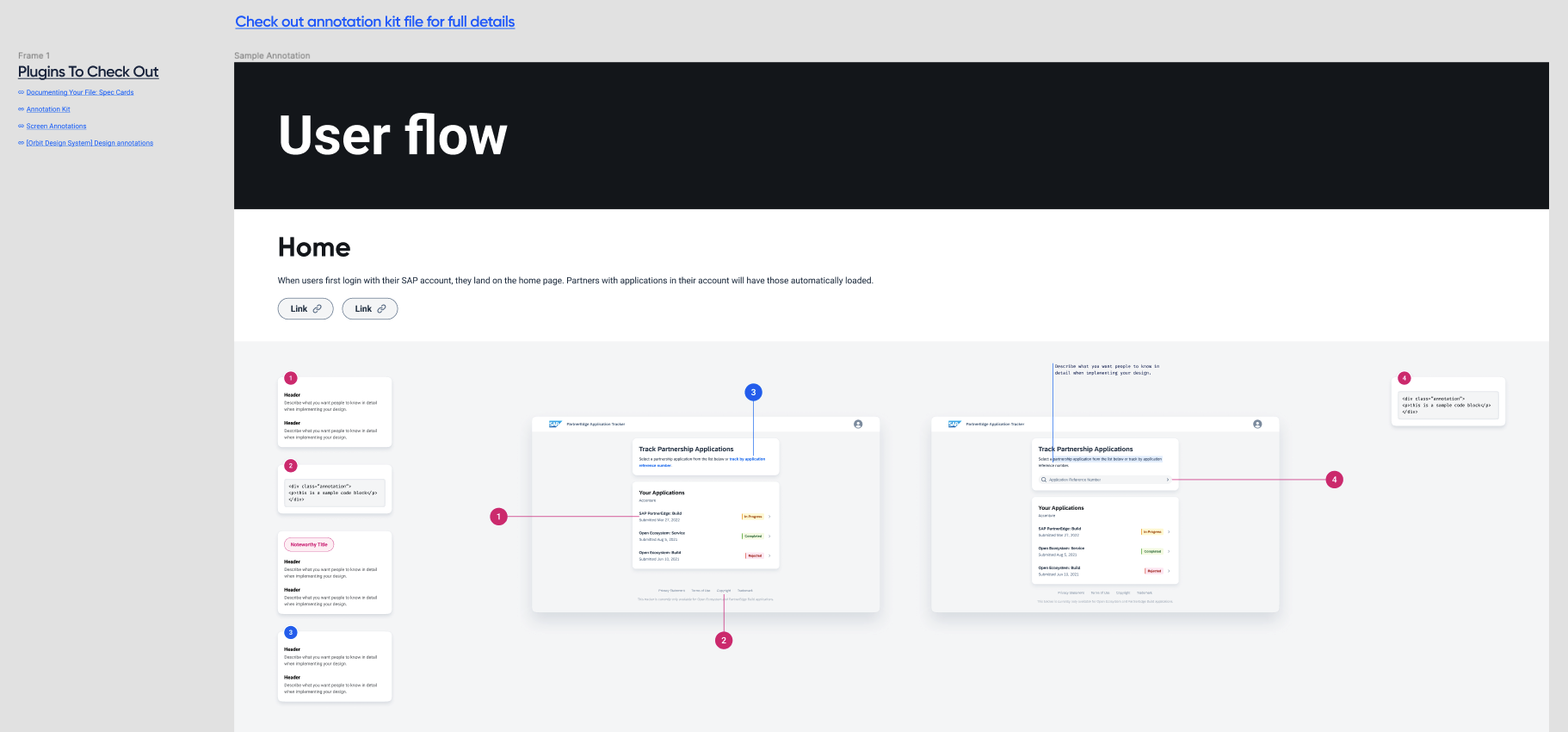
Figma Link Annotation Kit, by Kevin Chiang
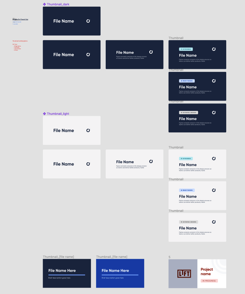
Now came the point of figuring out how to integrate these elements into our Figma files and processes. I spent a lot of time in Figma writing out ideas and iterating on file thumbnail designs, while adding annotation components for the team to use.
Map It Out
While this isn’t a typical UI prototype, it was nonetheless helpful to build a mockup of this system on a small scale to see if it could work. I started in FigJam by laying out an initial file structure.

Additional Refinements & Iterations
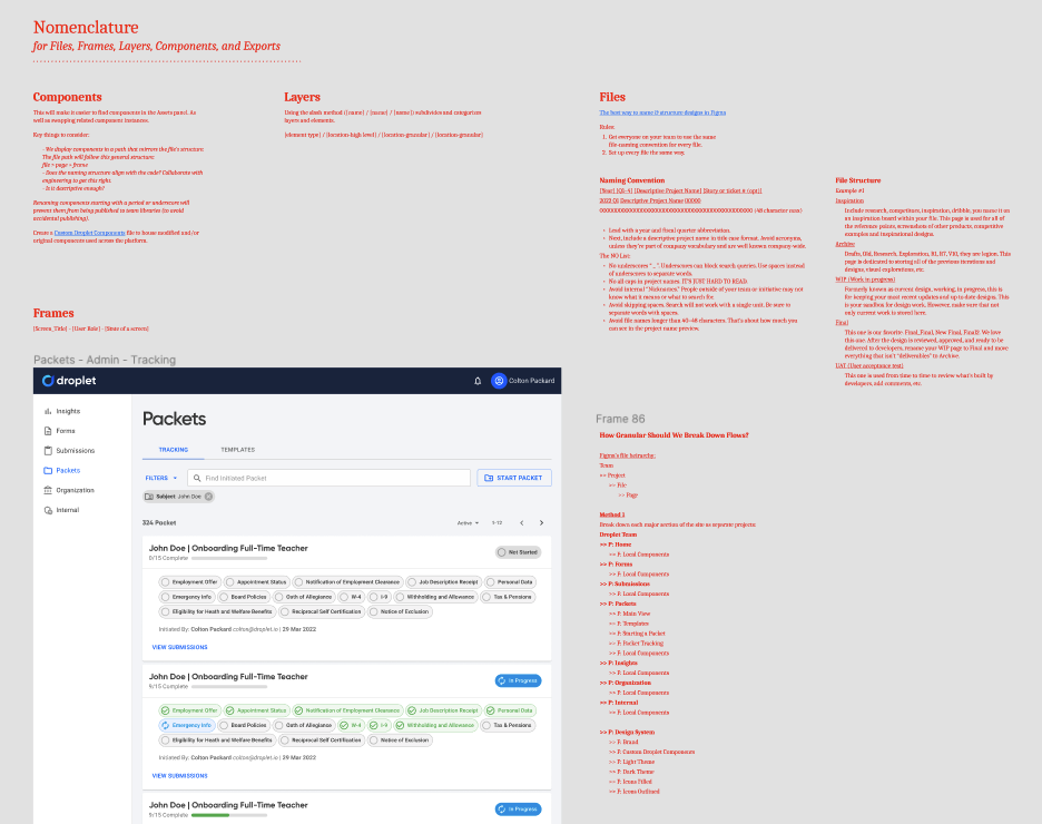
To really flesh it out, I created a mock project in Figma, populated with mock files utilizing this initial structure. I sorted and color-coded files by year, and quarters.
To address handoff, I wanted to ensure our designs were easy to navigate and well annotated. Since Figma didn’t yet offer sections, we sectioned off designs using frames we called “Floorplans”.

Project mock up

Floorplan example
Put it to the test
It came time to turn this loose and start observing where the holes showed up! We implemented this initial structure into current and new projects that arose at the time. What follows is our next iteration.
The Journey / Second Iteration
Desired outcomes
A scalable system that will work well as the team grows
A bottom-up influence that is flexible and informed by new improvements, but also allows us to enforce standards as is appropriate. Mitigate bottlenecks.
Designed for laziness, doesn’t unnecessarily slow down anyone’s flow
Can developers find what they need?
Can current designers find what we need?
Can new designers find what they need?
Admins can (relatively) easily make wide-reaching changes to the system when needed.
New problems to solve
Our first iteration for file sorting was quickly becoming obsolete. We could feel the friction around trying to maintain the sorting for our files.
Parent components were spread across numerous files. Handoffs became painful as copy/pasting designs into Master files resulted in broken component links.
The original component library was bloated and lacked many of the new components and styles we had developed over the last year.
We lacked any clear method for “canonizing” WIP components. We needed to know when and where to place final parent components during handoff.
We were debating splitting the system in half. One half for the general app, the other half for the visual builder.
System audit, oy vey
This had to be my least favorite part of the whole thing. Combing through the current system to determine what should stay, and what should go. Time to trim the fat! I started by marking up our Overview page, which luckily offered a summarized view of most everything in one place. This I reviewed with DJ, our Head of Product, to ensure I was accurate before I started chopping things down.

How should we “canonize” and house parent components while also managing file churn?
This alone could be a study in opening Pandora’s box. I took into account all our designer’s default methods for creating comps and files, and weighed those to see what worked and what didn’t. I then began mapping out possible methods for handling these things as, in my mind, they are intertwined with each other.
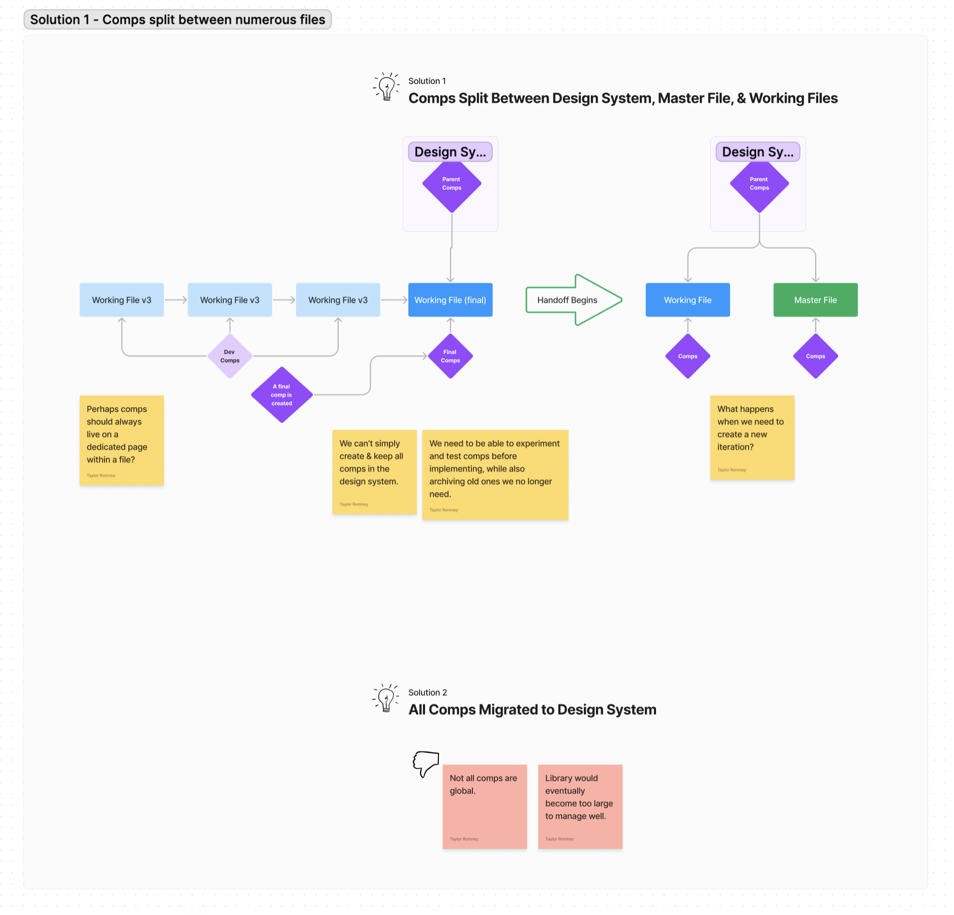
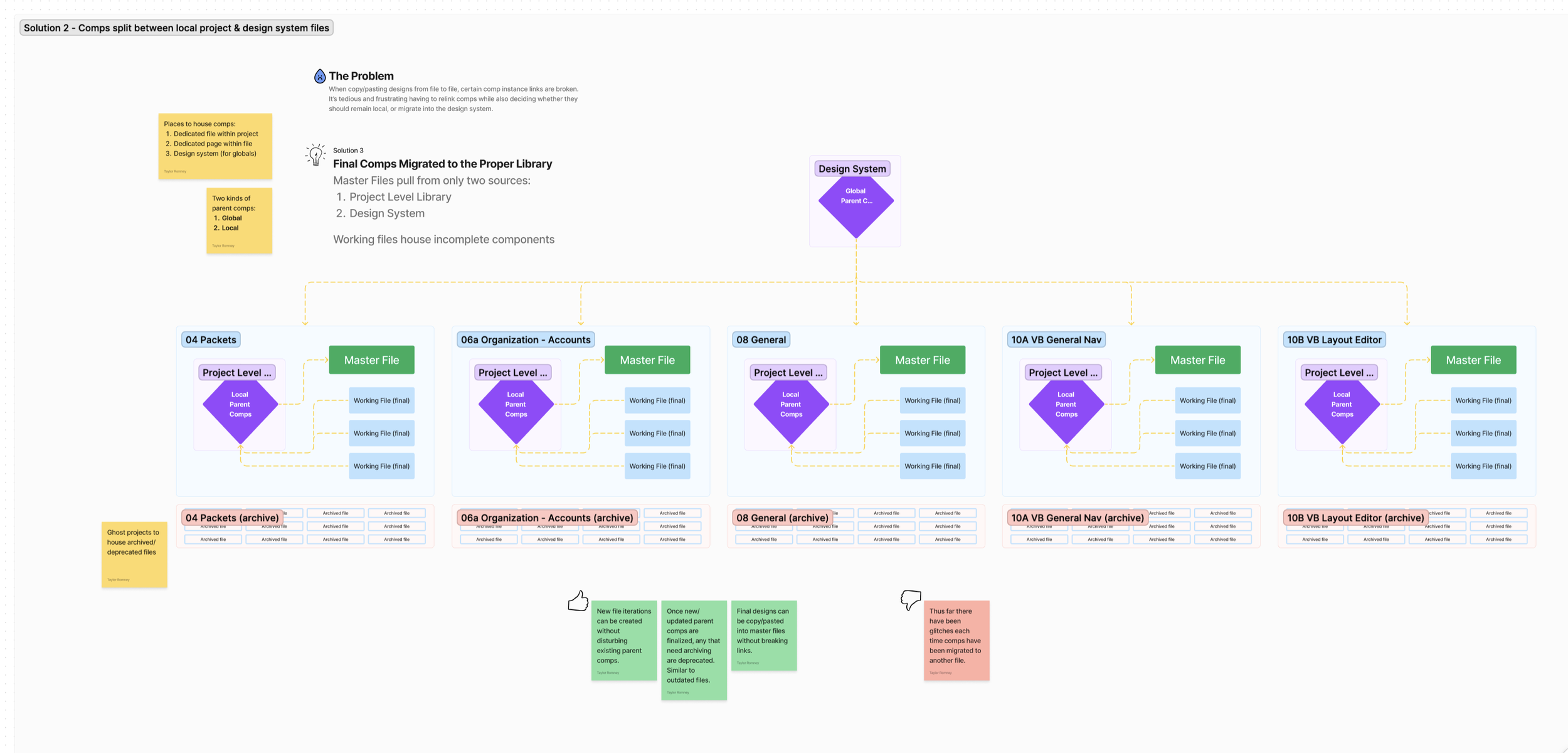
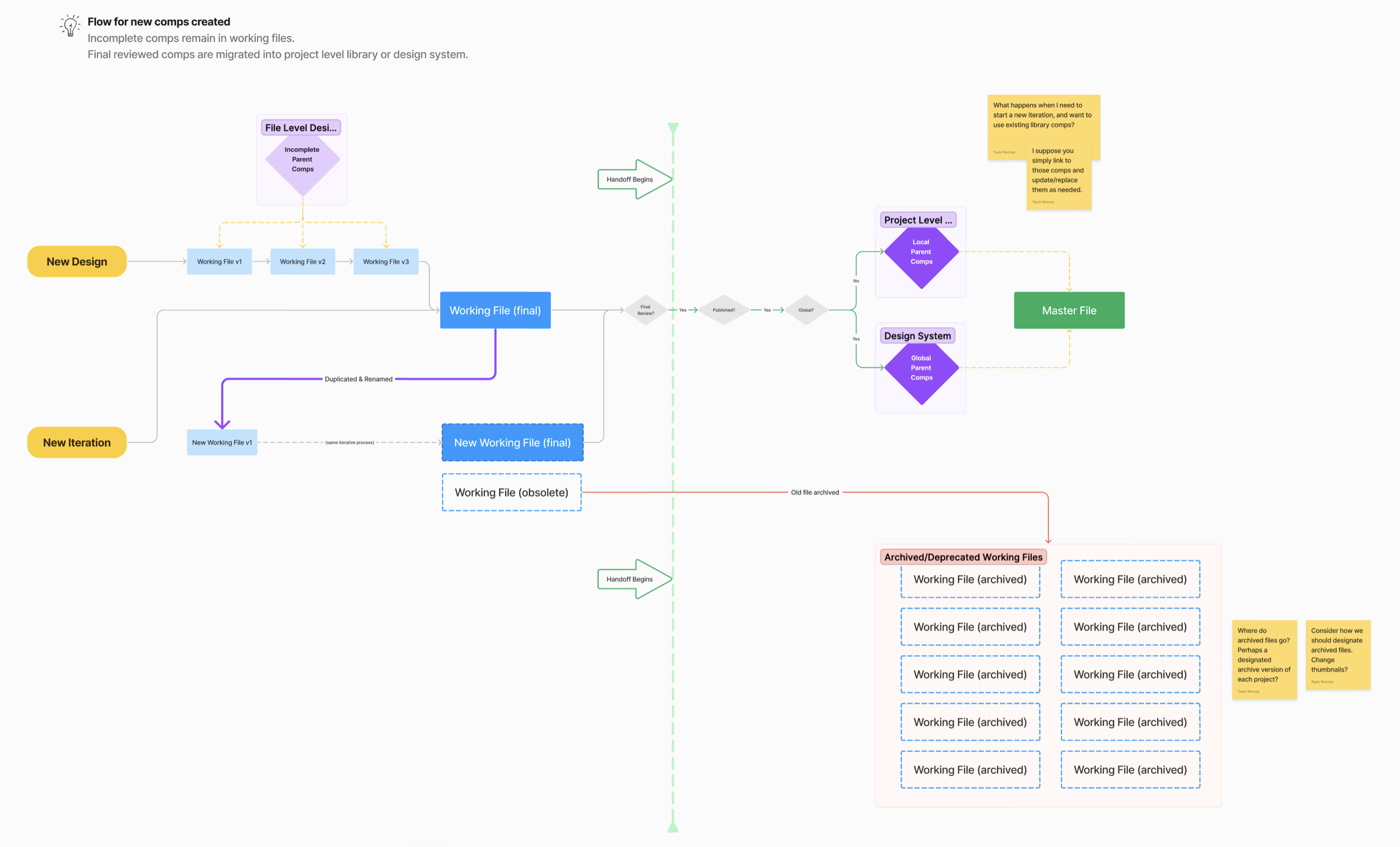
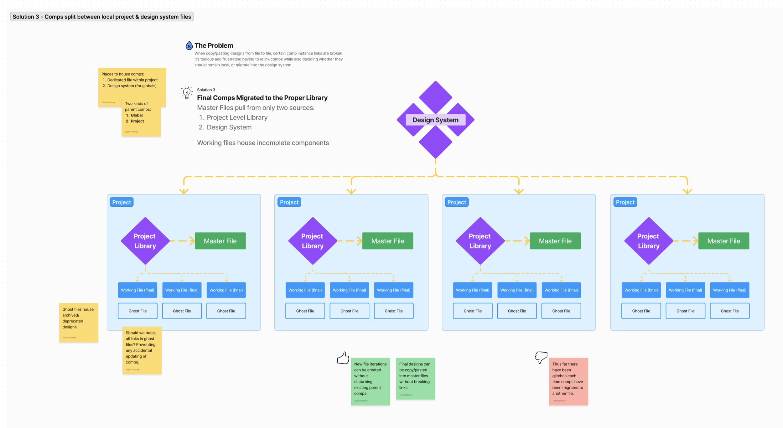
Further extensive debate and discussion among our design team eventually landed us on the following arrangement:

Tokenization of colors

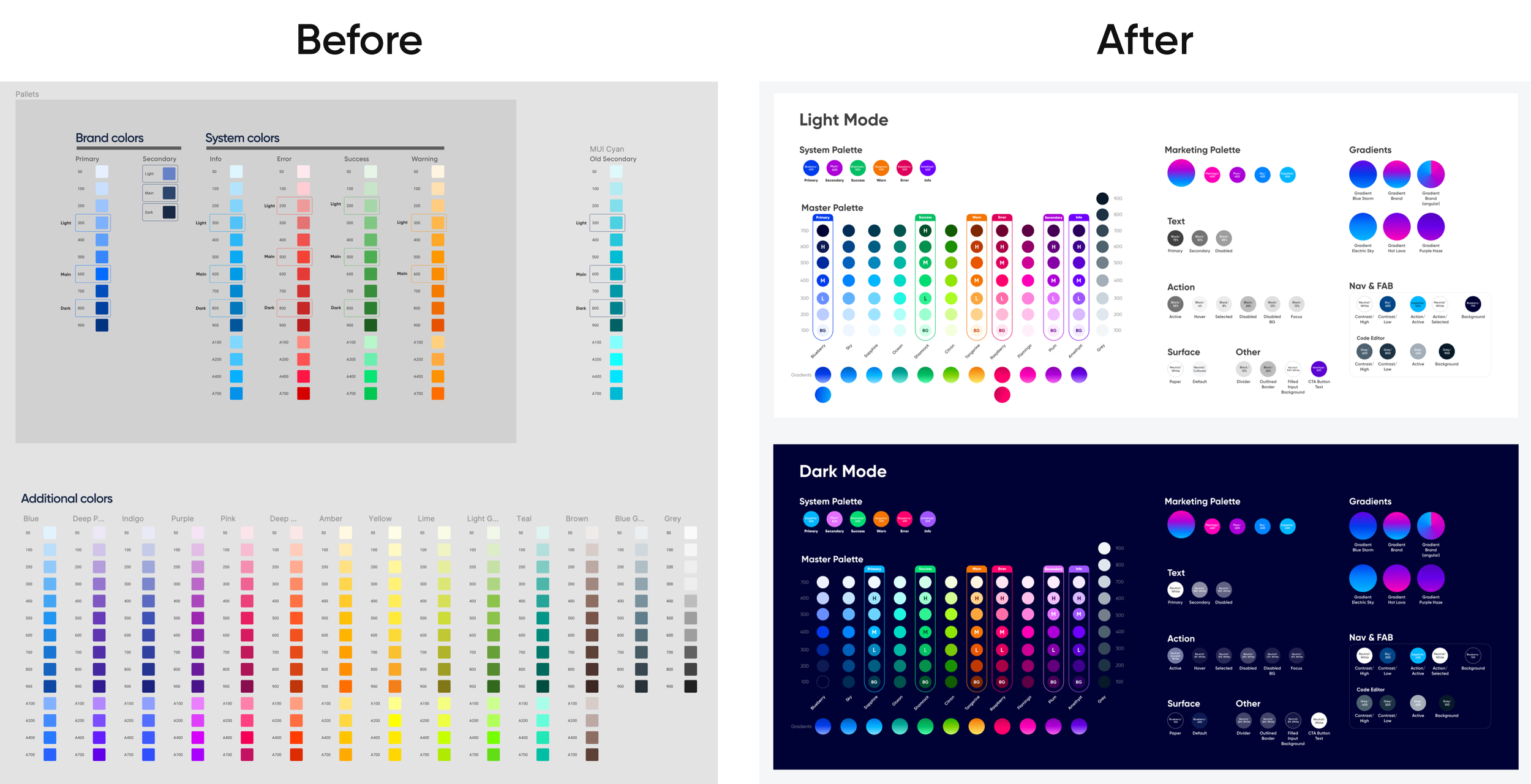
With a new structure in place and implemented, the cherry on top was reworking our color system. It so happened that the timing of this coalesced with a rebrand that was also underway. This was mainly led by our senior designer Jay, who played a major role in determining the direction our color palette should go. While he sorted through an initial proposal for a new palette, I began laying the groundwork for transitioning everything using variables.
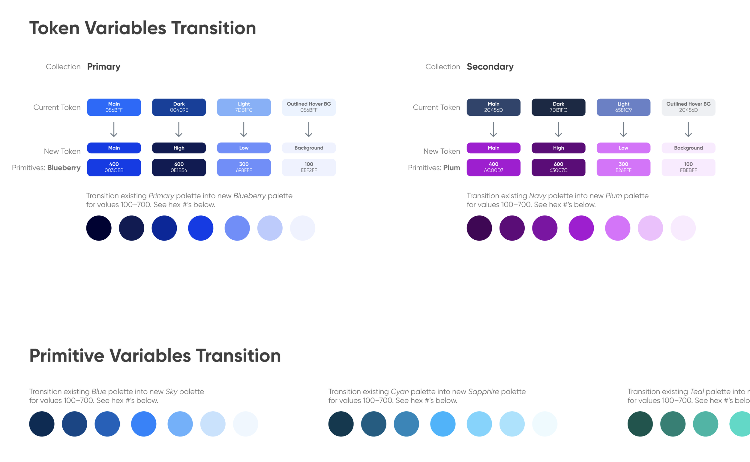
We had not yet implemented color variables into our system, we relied on styles. To begin the transition, I created primitive and semantic variables for every existing color in the system. I then linked every style to a variable, with the intent of publishing those connections, then breaking the styles so they could default to the linked variable.
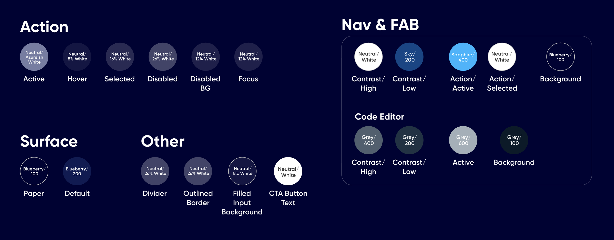
Iteration and expanding to include dark mode

Jay’s proposed new palette
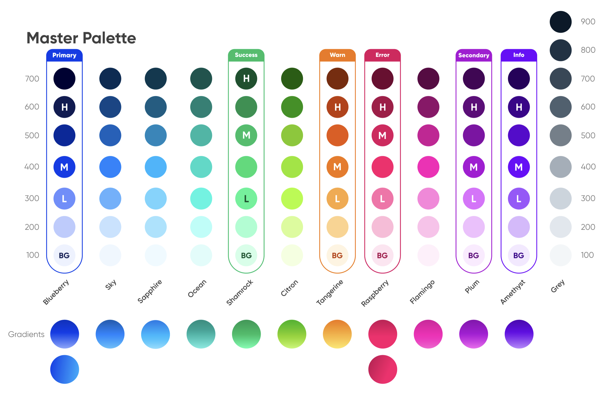
As a team we then dug into iterating on Jay’s proposed color rebrand. We shifted from a primarily blue palette provided by MUI, to a much more punchy palette of saturated blues and magentas, with supporting colors crossing the spectrum of greens and reds. This took extensive iterations, and made us realize we also needed to build dark mode versions of every color.
While building this system out, I created sections that would act as master references for the color system as a whole. This would be especially helpful to our engineers as they navigated the transition and familiarized themselves with our new variables. I also laid out a section detailing which colors would move to a new hex value, while the rest would be discarded.
Final Deliverables
Business Results
Completion of the properties panels and step details panel, plus the addition of Visibility, were keystone pieces of our visual builder tool. These paved the way for unlocking contracts valued at over $150M in total, and made us a prime competitor in the space of digital form building software.
Retrospective
What Went Well
The team was very receptive to new ideas. Collaboration was always productive and allowed us to consider the long-term effects of our system’s configuration.
What Didn’t Go Well
The scale of this project could easily have necessitated another designer’s assistance. I performed the entire process of auditing, deleting, merging/migrating, and organizing of all components within the system. A Herculean task.
Nailing down colors was an epic nightmare. Each day we’d conclude that we’d figured out the necessary primitives and aliases, only to come back the next day realizing we needed more.
Future Improvements
Assigning more than one designer to manage the next iteration of our system could prove beneficial.
End Credits
My fellow collaborators: DJ Misurelli, Head of Product // Jay Wilkinson, Senior Product Designer // Chrissy Andreasen, Senior Product Designer // Matt Stauffer, Software Engineer // Charles Jones, Software Engineer // Norm Johnson, Software Engineer // Chad Donohue, Software Engineer
Like what you see?
Please reach out to me! You can find my information on my contact page.